

Logo Showreel: My 10 year anniversary
This year marks my 10th year as a full-time designer. I’ve come a long way since my first graphic design job at Runner’s World magazine.
This year marks my 10th year as a full-time designer. I’ve come a long way since my first graphic design job at Runner’s World magazine. I started a little late into my life, side-stepping from a career in project management at the age of 25, before eventually working my way up through the publishing industry to a brilliant role at the Daily Telegraph.
But since I went freelance in 2015 I’ve never looked back. The freedom to work with the clients I choose, along with a lifestyle that allows me to spend more time with my wife and daughter, means the absolute world to me.
However, as my freelance career has burgeoned, I’ve always felt like a bit of a mercenary. A gun for hire. I’ve worked hard at advancing my skills in all sorts of design areas, and that has meant that as a ‘pay-by-the-hour’ freelancer I’m incredibly hireable, as I can work across projects that require photoshop work, print design, branding, website building and even video production and animation.
But since I haven’t focussed my expertise in any one area, my ‘business of design’ has plateaued.

10 years of logos
Time to specialise
Recently, I made a business decision to start transitioning to working only as a logo designer.
That’s right, just branding jobs for me from here on. It’s the part of my job that I enjoy the most. It’s pure creation, and most importantly I’m good at it. So over the next year, I will be taking on as many logo design jobs as I can get my hands on, and gradually moving on from working as an ambiguous, Jack-of-all-trades graphic designer.
James Barnard - Logo Designer
With my laser-focussed business model now decided upon I set up a landing page, and recently completed the showreel above to market my talents. I’ve also worked hard on a new pricing structure, moving away from hourly billing and building in three tiers of packages called ‘Starter’, ‘Professional’ and ‘Deluxe’. If you’d like to know more about these design packages, then please get in touch.
Why I’m ditching Wordpress for Squarespace
This month I followed the advice I’ve been giving to my clients for the past year and moved my portfolio (this website) onto Squarespace.

It’s 4am. My phone buzzes as an email arrives from WebGazer Alerts with the subject, “Heads up: Barnard.co is down”.
I visit wp-admin, the Wordpress backend, and the favicon in my browser tab just spins. I’ve got no way into my own site. I drop a message to a friend of mine, a back-end developer and ask for help. When he wakes up, he tells me, “Hmm, I’m struggling to connect to your box via SSH”.
U wot m8?
This happens ALL. THE. TIME.
Someone has hacked into my site either via an outdated Wordpress plugin, or is trying to brute force my Wordpress password and has subsequently crashed my site by overloading it with traffic.
I once logged onto the homepages of all of my client’s websites to receive the creative ditty in the top left-hand corner, “Site hacked by hacker”.
I don’t have a clue how to fix issues like this. So, flustered (usually with clients screaming at me) I go pleading to my back-end mate to help me fix it. It is a nightmare.

The other day, I logged into the backend of my portfolio website to receive the message that multiple pages on my site had experienced page errors. As usual, I hadn’t touched a single thing on the site in months, so an automatic update to either the theme, Wordpress or a plugin has caused a bug that has destroyed half of my website.
And without extensive knowledge of PHP, I won’t be able to fix it.
NO MORE!
This month I followed the advice I’ve been giving to my clients for the past year, and moved my portfolio onto Squarespace. I completed the site migration in about two days, and needed zero help from any developer. The site is cleaner, easier to navigate and I even managed to set up 301 redirects so that my old content links after a few url changes.
There’s even an import tool to migrate all my old Wordpress posts into Squarespace, so the bulk of the work was resizing images into a new, larger format.
Let’s be clear
I am not a developer. I’m a freelance graphic designer that knows enough CSS to be able to hack a Wordpress theme into doing largely what I need it to do. I’ve only ever built simple poster websites on my own. The largest Wordpress project I have tackled is a wine shop with e-commerce functionality.
Sure, I have designed some complex systems in my time, for some massive companies. But I have always worked as part of a larger team, usually with front and back end developers to build my designs for me. And most of my personal clients these days are smaller businesses, that don’t require masses of bespoke functionality. They just need a website that they can be proud of, that looks nice and tells their story. I can help with that.
When I first discovered Wordpress (around 12 years ago) I was astounded by it. It meant that I could design a website for a client with a CMS system built in. And it was free! So with a carefully selected theme, and a little CSS jiggery-pokery I could give a website to a client that they could make changes to themselves (and I could charge slightly more for the privilege).
But somewhere along the way drag-and-drop website editors actually became useable. And Squarespace allows you to get surprisingly granular with the styling. So lowly designers like me now have a chance at building something beautiful.

“If Squarespace is so easy to use, then why do I need a designer?”
A fair point, and a question I get asked a lot in briefing sessions. After all, the Squarespace model is software as a service. You have to pay a subscription fee to use it, so why not save some costs and build it yourself using the amazing editing tools?
Because, good-looking websites still need that special something to stand out (aesthetically) from the crowd. Visual assets.
That, and a watchful eye for layout. Start adding your website content to the templates in Squarespace, and you’ll quickly find that the design gets away from you. Plus, without good iconography and decent image edits, your site is going to look the same as everyone else’s. The templates in Squarespace are a brilliant starting point, but after a few hours of tinkering, inconsistencies in spacing, text hierarchy and colour schemes will soon become apparent. And that polished theme you started with starts to become Frankenstein’s monster.

A map asset I made for the National Forest Trek website
There are other advantages. A designer will protect your brand, especially if they’ve worked with you to create it in the first place (a common situation for a logo designer like myself). Customising fonts and colour styles can be a little laborious, no matter how you cut it. So having a professional work through your site to optimise the styling for different screen sizes can be a real bonus.
On top of this, there are more cost savings to my clients. I mostly charge based on my time, and if a project takes longer it costs the client more. Setting up a Wordpress install and tinkering it until it looks and does what I want it to takes ages. The yearly fee for Squarespace is £180 (for a business plan), but the money saved on design costs pays for that ten times over. Because the simple fact is that I can knock up a Squarespace website three or four times faster than I can a Wordpress site.
But wait, there’s more
Yes, you can obviously make changes to your site yourself. And it’s a damn site easier than using Wordpress. But more importantly, if your website goes down in the middle of the night, and I’m in bed asleep (or more likely tending to a teething one-year-old), you won’t have to wait for me to wake up to fix it. Squarespace’s 24/7 support will handle that, which also benefits me massively as I can hand off the site completely at the end of a design project.

NXGN: I site I made for a sports mentorship project
Also the Squarespace subscription is basically what you would pay in hosting costs for a website with semi-decent traffic. And you can migrate your old website over incredibly easily (see above).
And, for me, this is the real clincher.
It allows me to offer payment options for non-profits or startup businesses that just don’t have the funds to invest in an all-singing, all dancing website. I can design a basic page template, set up their logo implementation, pick the right colours and fonts and just let the client run with this.
The editing tools are designed specifically for anyone to be able to do it, so clients can go ahead and do the grunt work of populating a basic template without me. Sure, the end product might not have the same polish that it would if I could complete the entire project, but it allows for professional grade design to become accessible. And I have already worked with a number of one-man-bands and charities to help them get their businesses off the ground. Building Wordpress sites for clients like these would result in me having to turn the job down due to lack of funds.
I still love you Wordpress
I’ll always hold a soft spot for Wordpress, and there’s a reason why a quarter of the world’s websites run on it. It’s a powerful product, and I’ll be forever indebted to the founder Matt Mullenweg for giving it away in an open source format.
I based my career off of building CMS websites for clients, and having knowledge in how to use it has opened up so many opportunities for me. I started as a ‘web designer’ and that job title has morphed and eventually been cast aside as I’ve delved more and more into graphics and less and less into development. To the point where the basic coding I learned at university (building table-based websites) is now utterly useless, and instead of investing the time to stay up to date with HTML/CSS and what ever the f*ck coding languages there are now, I’ve invested my time in learning video editing, animation and picking up new skills in design software.
So when a product came along that allows me to really design a website and see it live, quickly, with no knowledge of coding needed, I just had to make the switch. That and I’ll never get chills again from receiving an email with the subject “Your site has updated to Wordpress version 4.9.11”.
EXAMPLES
Here are some gifs of sites I’ve made with Squarespace. Note the video backgrounds, parallax content blocks and some subtle animations. They are a mixture of the powerful editing tools of Squarespace, combined with video edits/animations and luscious graphics that I have created for the clients.
If you’d like my help creating something like this, then by all means get in touch.
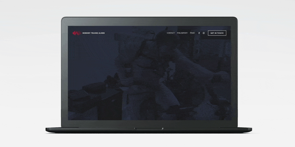
Nobody Trains Alone

David Edgar Football Coaching

National Forest Trek (sorry for the jittery scrolling)
Join The Resistance: Keep Your Distance
With the coronavirus spreading to all corners of the world, the United Nations and Talenthouse enlisted the help of creatives around the world.

With the coronavirus spreading to all corners of the world, the United Nations and Talenthouse enlisted the help of creatives around the world.
Thousands of creators generously submitted their work to help communicate important messages that can combat the spread of COVID-19. The creative work was free to share and available in multiple creative formats and languages, and of course, I submitted a piece!
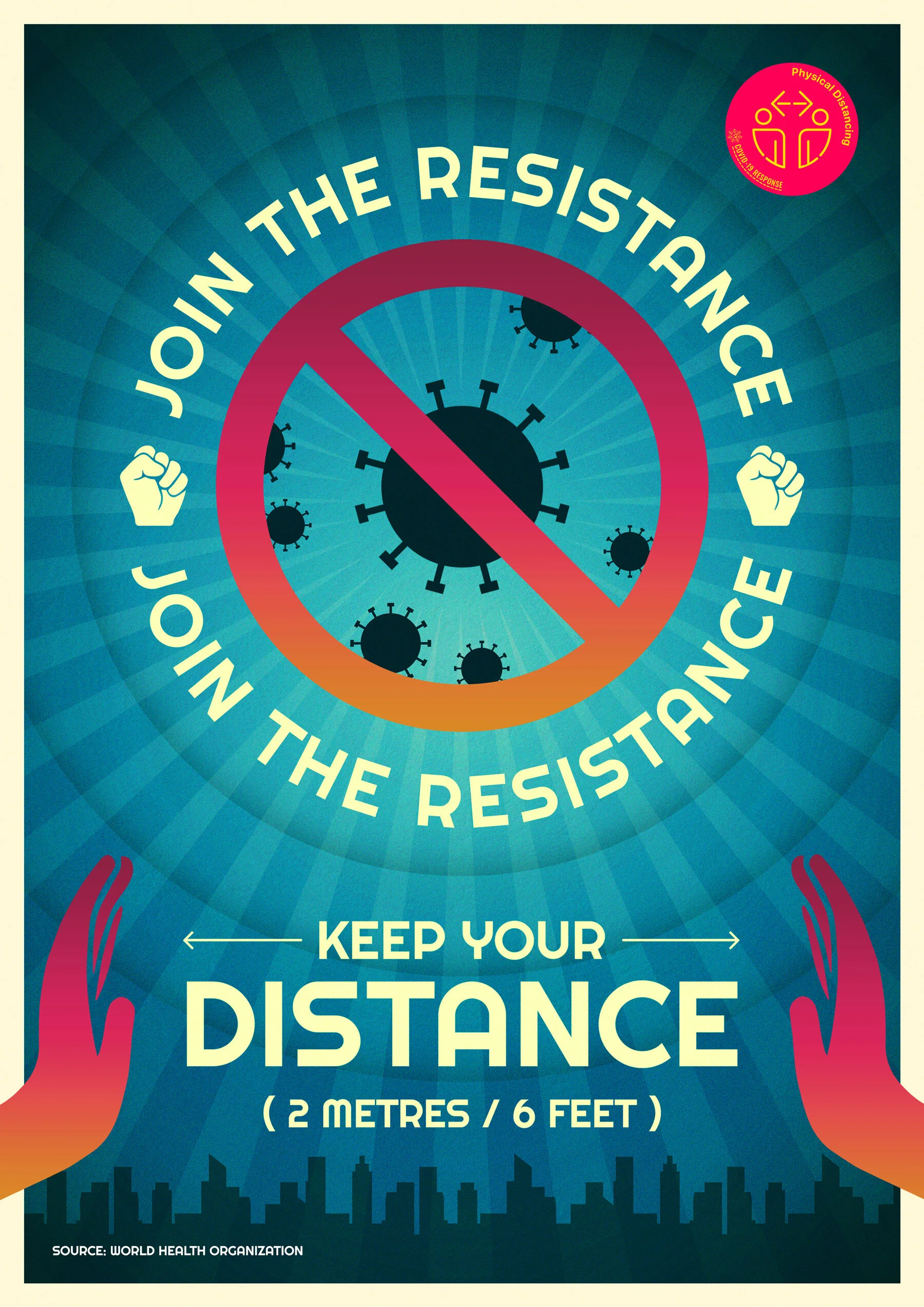
I tried to theme the design as an old propaganda style poster, with a punchy slogan, chunky lettering and some weathered colours (apart from the pink/orange gradient, which is trying to stay in keeping with the UN badge).
My submission was eventually shortlisted, and added to the pool of content housed on the campaign’s website. This meant that anyone around the world was free to use the work in any format, so long as I was credited.
You can find the poster here.
Engraving the Barnard Crest
Two years ago, I digitised our family crest as part of a Christmas present project for my Dad. My dad is massively into genealogy, so I made him an A2 family tree, using his extensive research of our family lineage.

Two years ago, I digitised our family crest as part of a Christmas present project for my Dad. My dad is massively into genealogy, so I made him an A2 family tree, using his extensive research of our family lineage. But since we could only find a low resolution version of our family crest, I decided to turn to Adobe Illustrator to make a vector version.
Adobe Illustrator
It's my dad's 65th birthday this year, and as a gift my brother Edward and I decided to get the Barnard crest engraved on a silver coin for him. It's a present that combines his two favourite hobbies; numismatics (otherwise known as coin collecting) and genealogy.
My brother had tried to get this done before, but he was initially quoted something alone the lines of £1000! I believe that this was because they would be using a pressing machine to stamp it to a coin, and creating a 3D press would have been hugely expensive.
Instead, I looked into laser engraving. This is a much cheaper solution, but I would need to create a single colour version of the crest. So I dove back into Illustrator to make a vector version in black.

I moved the diamond away from the bear, outlined some of the detail and cut the white away from the black, so the final file was a single colour shape.
The next step was to create a coin design.

I made an inverse version to sit inside a black circle, and then added some detail around the edge to mimic a coin style. This was then sent off to the engraver as an EPS, to be added to a one-inch disk of sterling silver.

A chap called Lester at Laser Engraving Services, used a fibre laser to score the design, and then coloured it with platinum for a dark finish. And on top of this, they turned it round in a day. I sent the design files on a Wednesday, and had the coin in my hand on Thursday!
The result was amazing. I was so pleased with how this turned out, as was my dad.


Barnabus in Primrose Hill
Last summer, my wife Laura and I received the most incredible news that we were expecting a baby girl. We quickly panic-bought a house with enough room for a baby, and once her room was ready we would need to fill it with pictures.Ever since she was little, Laura has been doodling this creature she calls Barnabus.

Last summer, my wife Laura and I received the most incredible news that we were expecting a baby girl. We quickly panic-bought a house with enough room for a baby, and once her room was ready we would need to fill it with pictures.
Ever since she was little, Laura has been doodling this creature she calls Barnabus.

Barnnabus Doodle
We thought it would be nice to create a version of Barnabus in Primrose Hill (where Laura and I lived during most of her pregnancy) to go up in the baby's room! I recently watched this tutorial on noise brushes by Dan Gartman, and thought it a perfect opportunity to give this a go myself. This is the reason for using photoshop over illustrator for this project.
You'll see in the video that the composition took quite a while to set up. But once in place the colour and shading portion was really fun.

Barnabus in Primrose Hill: Barnard.co
A beginner’s guide to screen printing, by a complete beginner
This is a wrap up of a screen printing course I took with The Print Club London. It’s mainly so I can remember what to do next time I give it a go, but I hope you find it helpful too!
[This is a wrap up of a screen printing course I took with The Print Club London. It’s mainly so I can remember what to do next time I give it a go, but I hope you find it helpful too!]
I got my start in graphic design as a digital designer, working for the website arm of a magazine in London. On the job, I picked up the basics of print design, largely by shadowing a colleague.
I quickly realised how satisfying working in print can be. When I could actually hold my designs in my hands, I found that I felt much more of a connection to my work, and I began to appreciate the finer details. There’s something quite therapeutic about spawning something tangible, over designing a webpage that you can only share on screen.
During my time at this publishing company, I visited the print factory where the magazines were made, and learnt more about different printing techniques. But one method that I’ve always wanted to try is screen printing. I have at least four screen prints on the walls in my home, and I absolutely adore the styles that are possible using this very simple technique. So last week I called in a belated Christmas present from my wife Laura and took a two-day screen printing course at The Print Club, London.

Day 1
The first day was spent learning the basics of screen printing, a little history, and learning how to set up our pre-prepared artwork files ready for printing on day two.
I spent quite a long time deciding on what artwork to prepare for the course. We would be printing using two colours, and I was told to bring a laptop with a photoshop design and my two colours already separated.
My wife Laura is famous among our friends for accidentally swapping out the wrong word in a sentence, or getting phrases ever-so-slightly wrong, but close enough so that you understand what she means. Some of her highlights include…
“The Harlem Witch Trials.”
“I’m just so asphyxiated by that picture on the wall over there.”
“I couldn’t get a word in sideways.”
“That smell is really feng shui for me.”
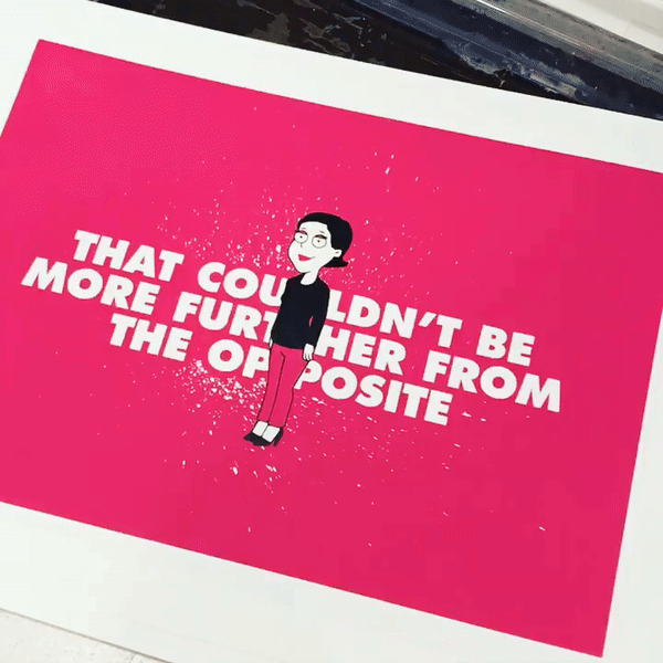
Using one of these phrases, along with an uncanny depiction of her I made using the website familyguyyourself.com, I made an A3 poster in shocking pink and black.

I traced the character in Adobe Illustrator and added a paint splatter effect behind the text, then brought everything into Photoshop for some tweaks and colour separation.
Registration and trapping.
Our class of six was shown some real-world examples, which were mostly done by artists based at The Print Club. I was absolutely blown away by what is possible using only a few colours.
This piece by Steve Wilson, for instance, was printed using only three colours (cyan, magenta and yellow). Using combinations of ink layers, the most incredible effects can be created. The gradients here were made using halftone dots.

Another piece here, demonstrated by our class tutor Simon, shows two versions of the same screen print, using the same colours, only printed in different orders!

We were also shown what can go wrong during the printing process. The Print Club has a poster show each year called Blisters, which has some seriously high standards for acceptance. One of the main reasons a piece might not be accepted is due to the mis-alignment of the colour layers. This alignment is called registration.
If the registration is off by even a millimetre, meaning the colour layer on top of a previous layer isn’t lined up exactly, then parts of another colour, or even the white paper underneath can show through the cracks.
This was a problem for my artwork. The black layer would be printed on top of the pink. Anywhere the black layer touched the pink, like the eyelids or around Laura’s head would need to be lined up utterly perfectly, otherwise white strips would show through.
With this in mind, I added an extra millimetre of pink to the edges of the first layer. I couldn’t think of a quick way to do this in Photoshop, so I painstakingly painted this in with the brush tool.

This process is called trapping. The last colour layer hides any mistakes, as long as that colour is dark enough to cover any previous layers. Trapping my artwork would prove crucial later on.
Halftones and 50% threshold.
Once my two colours were separated to layers in photoshop, the file needed to prepared for printing onto ‘positives’ which would be transferred to my screens later.
To make your artwork edges appear smoother, Photoshop does this really clever thing called anti-aliasing. This goes back to the early days of digital fonts, when typesetters needed to make really small pt sizes work on pixellated screens. What happens is in areas of contrasting colour, the pixel values are changed to a series of varying colours and shades, to give the appearance of a smooth edge.
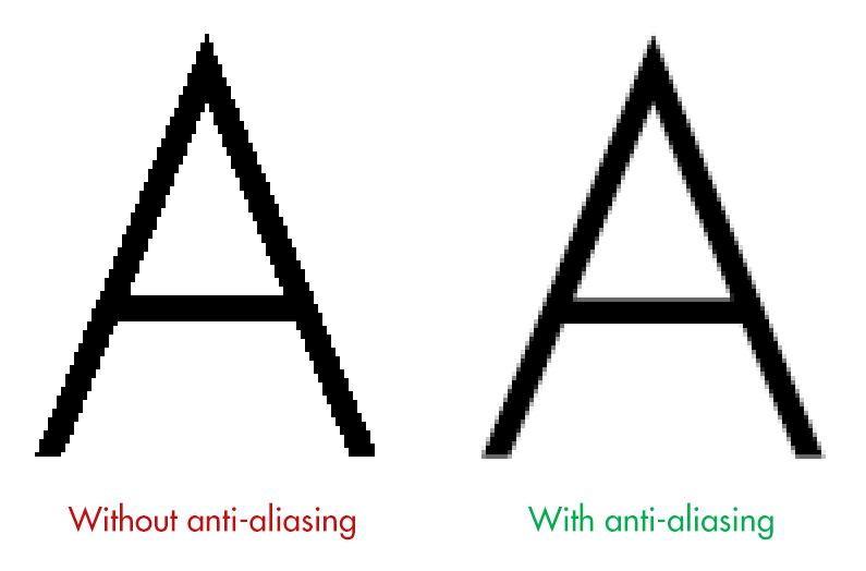
In screen printing however, this is bad. We can only print using a solid colour, not shades. So each colour layer needs to be converted to a bitmap.
A bitmap file is perhaps the simplest form of image file there is. It consists of pixel values of either black or white. That’s it. When we use a bitmap file to make a screen, we either get colour, or no colour, which is exactly what we need.
In Photoshop, we start by removing all colour from the image by converting our file to grayscale (Image / Mode / Grayscale). Then we can change our file to a bitmap (Image / Mode / Bitmap).
In Photoshop we’ll usually get a pop-up message with a few options. With a solid colour, illustrated design, like my artwork, this part is easy. Using a 50% threshold, the artwork is easily converted into black and white pixels. My artwork started as a vector, so its contrasting areas were solid blocks.

This file was now ready to be printed onto acetate to create my ‘positives’.
If, however, you want to convert an image with a much higher level of detail into a bitmap, like a photograph, we have to use a halftone.
This converts areas of contrast into a series of larger and smaller dots, to give the representation of shading.

Halftoning is almost an artwork to itself (see Roy Lichtenstein or Ben Day Dots). Doing this process in Photoshop can be real trial and error. Any artwork with a gradient (see the Polaroid example above), or solid colour going from dark to light, needs to be converted to a halftone.
Transferring our artwork to screens.
I exported my two layers as pdfs, which were sent upstairs for printing in solid black onto acetate.

To get my artwork onto a screen, we first needed to visit the dark room.
Here, our instructor Simon walked us through the process of transferring photo-sensitive emulsion onto the back of our screen. Tipping the emulsion from a tray onto the screen and then sliding it up to the top (in the dark) was a little tricky.
From here, the newly-covered screens were moved (quickly) to a dark, heated cabinet to dry for around 20 minutes.
Once dry, we started actually transferring the artwork to the screen. This was done on a behemoth of a machine. The acetate positives were placed face up on the glass, with our dry screens (with a coat of emulsion) centred on top. Then, with the machine lid down, a vacuum is formed around the screens to force them onto the glass and to keep them still.

A strong UV light is blasted onto the screen for about 30–45 seconds.
When the screen came out of the machine, there didn’t seem to be much difference. You could maybe see a faint outline of the artwork on the screen.
However, when the excess emulsion was washed out (with a little scrubbing and some water) the artwork was as clear as day.
What was left was a screen with emulsion covering the areas that we didn’t want colour to pass through. And at the end of the first day, our screens were ready.

Day 2
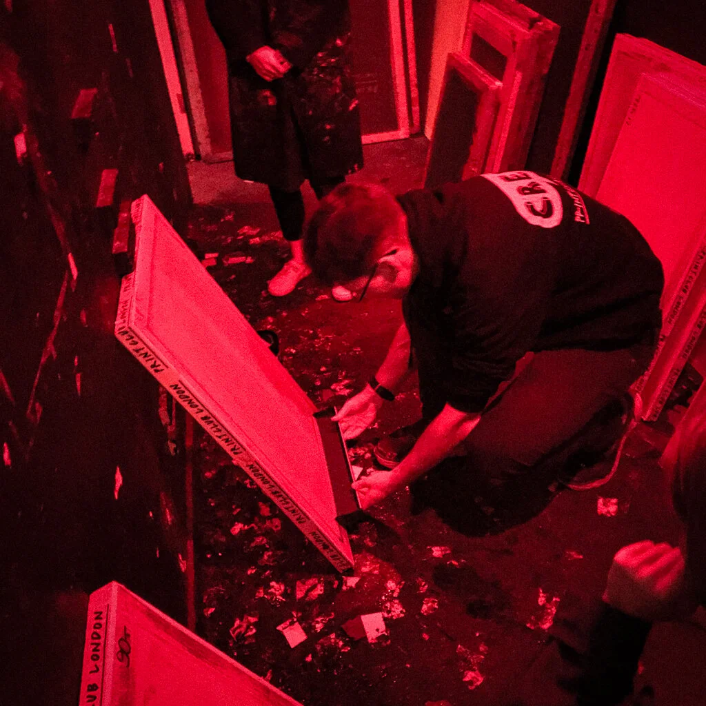
Returning to The Print Club the next day, I noticed some problems with my second screen. I’d been a little rough with the cleaning process and washed away a chunk of emulsion off of the shoulder of Laura’s character.
With a paint brush and some extra emulsion, I placed the screen over a light board, covered up the missing chunk and flattened it down with some card. I also covered any pinhole light shining through. This is a really important step because if light can shine through, ink can pass through as well. The screen pictured would use black ink, and black dots would really show up on the final artwork.

Once done, the artwork had to go through the UV bed again to harden the new emulsion. We also added brown tape to the edges of the screen frame, where the emulsion didn’t reach.
With the original acetate positive, I created a registration guide so that I could position my paper correctly under the screen for each pass of the ink. The paper stock was B3, slightly larger than A3, so I marked the position in pencil and taped down the acetate. This was then used as a template to position under the first screen, fixed to a metal frame over a printing bed.
Using a ‘registration stalk’ (a piece of long, blue card with masking tape on the end), we could slide our guide as close as possible to the correct position under the screen. Once in position, we placed a strip of masking tape under the corners of our guide and penciled in where our paper was.

Now we were finally ready to start printing!
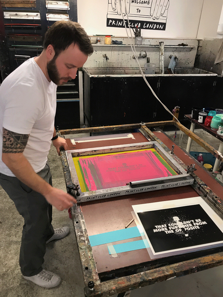
Pantone 232C
With a fresh piece of paper under the screen, I went to choose my ink. I’d picked out my Pantone colour the previous day and tried to match my ink as close as possible to this, adding some black ink to darken a ridiculously vibrant shade of pink.

Here’s how the printing process goes:
Raise the screen up off the paper and hold it in place with your belly (or rest it on your belt buckle).
Apply a thick strip of ink to the base of the screen, under the artwork with a palette knife, roughly three fingers width either side of where the ink will end up.
Coat the entire base of a squeegee, a slightly pliable plastic strip with a metal or wooden handle, by rubbing it around in the strip of ink.
With the screen still elevated, push the ink lightly over the screen, away from your body to coat the artwork.
Lower the screen onto the paper (the screens are weighted so the raising/lowering is super-easy).
Move the squeegee to the back side of the ink, ready to pull it back across the artwork. Press down firmly with your arms straight and pull the ink evenly across the screen.
Repeat step 1 and 4. Then place the squeegee in the ‘safe’ position, closest to the hinge (see below). Keep the screen up.
Remove your newly inked paper and place it onto a drying rack.
While I was waiting for the first layer to dry I washed out my screen with water. The Print Club uses only water soluble inks, which meant I could wash them straight down the sink.

Because I was also done with the artwork on my screen, I used the pressure washer and a slightly stronger cleaning product to get all of the original emulsion off of the screen, ready for the next person to use.
Second colour time!
The black layer was undoubtedly harder to lay down, but so much more satisfying. Once again, I set up my registration guide. This time, I placed my acetate positive over a test print I’d made during the first colour layer, so my paper position would be as close to perfect as possible. I lined up the guide under the screen and marked its position again.
The beds at The Print Club have air holes in them like a hockey table, only they work the opposite in that they suck rather than blow. So once my paper was in position, I could turn on the vacuum to keep the paper still before printing.
Another additional step was to fix a big sheet of acetate over the top of my printing paper, using a masking tape ‘hinge’ at one end. I could then print one coat of black onto this transparent sheet to use as a super-accurate guide for the second layer. I could then place my first colour layer underneath, line it up with the print on the acetate, turn on the vacuum, remove the acetate and screen print my black layer as usual.
Here’s a time lapse of the second colour layer…
Screen Print - Timelapse
The first couple were ever so slightly wonky. I was provided with seven high quality sheets in total, so the pressure was on. But the next five were almost, if not perfect registrations, which even had a couple of the regulars turning their heads. It was unbelievably satisfying.
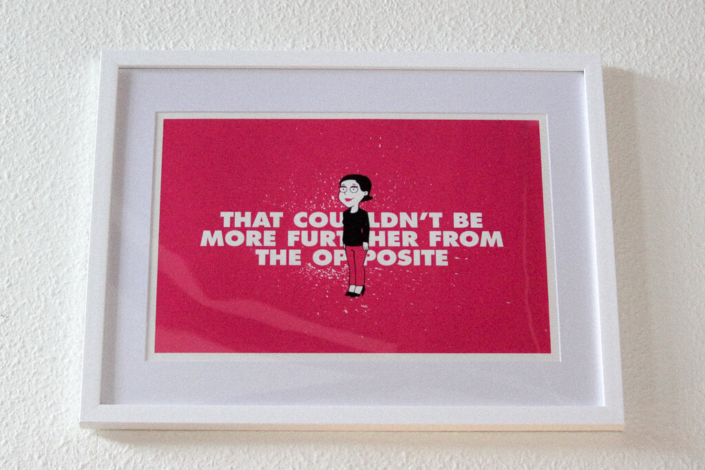
I want to say a huge thank you to Simon from The Print Club. I took the ‘Deluxe Workshop’ if you want to give it a go. You get to take home 7 or 8, two-colour prints at the end of the day. I had the best one framed and it’s been added to my collection in my living room.