Two moped thieves snatched my phone… and I couldn’t be happier
While checking Instagram and walking home in London last year, two guys on a moped mounted the pavement and yanked my phone out of my hand.

[I originally published this article for the Startup publication on Medium]
While checking Instagram and walking home in London last year, two guys on a moped mounted the pavement and yanked my phone out of my hand.
As my earbud headphones came popping out of my ears, with what felt like half of my brain, I blurted out some mindless expletive and pitilessly tried to chase them down on foot. As they were speeding away in front of me, blocked from getting back to the road by parked cars, I managed to memorise their license plate.
Running home, chanting the plate number out loud as not to forget it for the police later, I could not have felt more stupid. There is an insane level of phone theft in the city. It’s near impossible to catch these guys in police cars and they use stolen mopeds so they can’t be traced.
What made this even more aggravating, was maybe a few weeks prior I’d been discussing this epidemic with a family friend who works for a city unit, specifically designed to increase awareness about the nature of these crimes.
All the while I was adamant that my astounding presence of mind and superior peripheral vision would keep me from ever being susceptible to such a base and brazen crime.

Some awareness ads in London, UK
I submitted a police report and watched the blinking blue dot on Find My iPhone race into North London, before stopping forever on the corner of Finsbury Park.
The plate number was useless.
Fear and loathing.
The next morning, on my way to purchase a new phone, I ran a little experiment. During the 10-minute walk to the Vodafone shop, I counted how many people were using their phones in public.
Had I been the proprietor of a stolen moped, and so inclined, I could have made myself about £4,000 in stolen phones that morning. I felt like shouting at pedestrians, “PUT YOUR F*CKING PHONE AWAY!”
After picking up my new phone (I was luckily due an upgrade) I found that I was suddenly very nervous about carrying around a device worth around £800 in my pocket, a fact that I’ve never thought twice about before. When the average Joe is carrying a gadget that’s worth more than an entry-level laptop, there’s no wonder that daylight robbery (phone crime) is on the rise.

Furthermore, the fact that my phone was stolen while I was doing something as unimportant as looking at a cat photo, made this realisation all the more ridiculous. And it made me ask myself a question…
Am I addicted to my phone?
There’s a definite movement towards using your smartphone less. The New York Times recently called for Apple to make a less addictive phone. And for good reason.
Ask yourself, when your smartphone beeps or vibrates, do you find that you stop whatever task you are currently doing completely in order to check it? Or do you check your phone the instant you wake up, before getting out of bed? Something as innocuous as constantly watching your never-ending email could be a sign that you are more than a little attached.
Aside from disrupting our productivity, and changing our emotional and social interactions, there are genuine physical dangers.
A whopping 10% of mobile phone users confess to using their phone while crossing the road. And I don’t even want to think about the texting-while-driving stats. So why would a person risk their life to look at their phone?
The average smartphone user in the UK checks their phone 40 times a day.
But for teenagers, that number is more than double!
App-sessed.
My 15-year-old brother is besotted with Snapchat. He uses it almost exclusively as a messaging app. If he wants to text his mate to meet him down the shops, he takes a picture of absolutely anything (his shoes, an expressionless selfie, the corner of a table) and then writes over the image in Snapchat and sends it on.
When I ask him what the hell he is doing, he laments with sweeping statements like, “Nobody my age uses WhatsApp anymore”, pulls a pouty face to the camera and sends another image on with that tell-tale ka-dunk sound. If I pull a funny face behind him when he’s taking a selfie, he becomes enraged, much to my hilarity and unease.
This type of social connection and phone interaction is bewildering to me. As a graphic designer, who is supposed to specialise in digital interactions, this makes me sad at how out of touch I am.

On top of this, Snapchat have gamified the process, by introducing Snap-streaks that record the number of consecutive days users Snapchat with another person. Tristan Harris, a former Google Design Ethicist, talks about this feature in his TED talk. By introducing this feature, the makers of the app have given the user something to lose. Harris remarks that some teenagers even give away their user logins to their friends, enabling them to keep their streaks running if they go on holiday!
After hearing the notification noise on my brother’s phone for the 10th time in one minute, I’d had enough. I challenged him to a bet. It was 5pm. If he could make it to midnight without checking Snapchat, I would present him with a crisp, new £20 note.
Eagerly, he shakes my hand. “Easy”, he says, and the bet is on.
Thirty seconds later, his phone goes ka-dunk, and he reflexively reaches for it. Remembering in the nick of time, he stops and looks at me with a smirk, then places it back on the table. But that’s all it takes for his anxiety to peak. That little red (1) above the app icon is staring at him like HAL 9000 and he is now wringing his hands.

“Open Snapchat please HAL” “I’m sorry Dave. I’m afraid I can’t do that.”
This goes on for hours. He receives something like 40 notifications before midnight, and with each one he asks to be let out of the bet. “What if there’s a party or something, and I miss out on it?” He is visibly agitated, shifting in his seat.
To his credit, he doesn’t check the app. I magnanimously hand over the £20 with genuine regard. He, of course, dives straight in to the yellow Snapchat icon and starts consuming the messages. In little under a minute he’s done, skipping quickly through most of them. He puts the phone down.
“That’s it?”, I remark. “Anything interesting?”
“Nah.”
When app companies have a revenue structure that is designed to keep your attention for as long as possible (watching more adverts), then what chance does the younger generation have?
A walk in the park.
Since my brush with London’s underworld (pfft) I rarely, if at all, use my phone when I’m outside. The level of anxiety I feel when holding it in a public space is palpable. This anxiety is not just reserved for me. If my wife checks her Slack account while walking down the street, I actually feel a pang of anger towards her, such is her apathy.
A typical lunchtime walk for me.
With the exception of checking Google maps, my phone stays buried in my pocket. Admittedly this took some getting used to. The first few days after my phone was stolen, I had to stop myself from firing up Gmail on the go. I even checked a text in the exact spot my phone was pinched, before giving myself a good slap.
Very quickly, not feeling the impulse to check that Whatsapp message became second nature. And utterly liberating.
I have actually found that I now walk more out of enjoyment, over necessity. Perhaps subconsciously my mind is now associating this activity with a period of de-stress, and lack of visual stimulation. But since my outdoor screen hiatus, I notice more around me, and I’ve found that I am choosing to walk to a destination over catching the tube (distance permitting).

Top of the charts: my step stats vs my friends
In my case, I haven’t had to resort to techniques like turning my screen black and white. A forced break and a breath of fresh air each day is enough to curb my screen usage. Plus a concerted effort. But other than the obvious benefits of a little more exercise, I genuinely feel less anxious.
I guess I owe a thank you to the two bikers who pinched my iPhone. Although, I sincerely hope that this was them…
Moped gang who carried out more than 100 robberies in less than 3 weeks jailed for over 18 years https://t.co/cwTfpDCnpYpic.twitter.com/4peWzV5qgD
— Metropolitan Police (@metpoliceuk) October 11, 2017
Thanks for reading! This isn’t a typical article from me. I usually focus on all things design, but I find the psychology of phone usage fascinating (and terrifying). If you’ve tried and succeeded in limiting your screen time, I’d love to hear how you did it.
Some further reading…
Deloitte Mobile Consumer Survey 2017
What is technology doing to us (podcast)
It’s Time for Apple to Build a Less Addictive iPhone
Why We Can’t Look Away From Our Screens
Are you addicted to email?
Greyscale may curb smartphone addiction
Making my Dad's family (Christmas) tree
My dad researches our family history in his spare time. For his Christmas present this year, I decided to turn his research into an A2 family tree. Here's how I went about it...
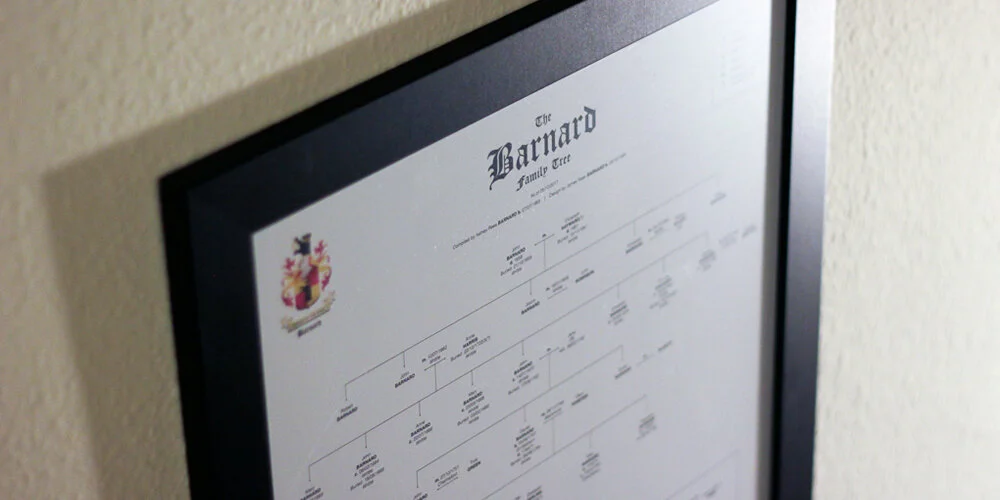
My dad researches our family history in his spare time. For his Christmas present this year, I decided to turn his research into an A2 family tree. Here's how I went about it...
I'd call Ashley (dad) Barnard an amateur genealogist, but when you trawl through birth, death & marriage certificates, search church records for baptisms, marriages & burials, hunt down newspaper entries and even look through church yards for grave inscriptions, all for the better part of twenty years, I think the title 'amateur' is a little unfair.
During this time, he has managed to trace our lineage all the way back to the year 1651.One year, he'll probably write a book on the Barnards. Until then all of his research is sitting in folders under his desk. His version of our family tree is formatted into one excel doc on his computer, where nobody can appreciate his work.
Compiling & Formatting
After my dad had sent through his findings I went about the long process off throwing everything I needed into an Indesign document. To make his excel document printable, dad had (over time) split it into 79 separate tabs. This took some sorting. Some pages were formatted top to bottom, some from right to left, and when there was no more room on the sheet, a line would point to a box that said something like 'See Barnard 2', which meant moving to another tab.
I immediately faced some decisions. There was simply no way to get the entire thing onto one, nicely framed poster. As soon as the tree hit the 1750s it branched out into multiple other family trees. The sheer number of people that this one dude spawned in the 1650s was staggering. To get the whole thing onto one A2 page I decided I would only trace my dad's lineage back to the first date. After all, this was a gift for him. This meant that I'd need to truncate the tree heavily.

Secondly, there were varying levels of detail on each entry. Some had entries like "Daniel Barnard, Farmer of South Wood", with dates for birth/death/marriage/christening; the whole works. Some only had "Died 1845/6 ?". Because of this, I decided that each entry would, at a maximum, show dates for birth, christening, death and marriage, and then place of birth and place buried only (if the research was there). Each entry would be restricted to a maximum of seven lines, which meant I could potentially format each person into equal-sized blocks, and would help with spacing later.

With the formatting loosely agreed upon, I started just throwing the people onto the canvas and drawing rough lines to work out how much content I was dealing with. At a text size of 8pt, the whole lot just fit (unformatted) on to a canvas a metre wide. Not good.
The Crest
The Barnard family crest is pretty badass. It has two bears on it. The name Barnard is apparently a derivation of the Germanic name Bernhard, composed of the elements ber(n) ‘bear’ + hard ‘brave’, ‘hardy’, ‘strong’.Unfortunately, we only have a low-res version in our possession. So I spent some time in Adobe Illustrator tracing the crest and generating a printable version using simpler colours.
This version would be used later, along with a title and a key, for the heading on the poster.
Design
After researching how to format a family tree (and not finding a definitive answer) I decided on a simple Helvetica font, with the surname as caps, and births, deaths, etc in bold. I also created a symbol that denoted a continued lineage, where the tree could no longer fit on the page. I added this to a key in the heading and began to work through formatting and aligning each of the entries.

With the format agreed upon, it was just a case of spacing each entry equally across the height of the page. There were eleven generations to squeeze on. Leaving space at the bottom for a short note to dad, I drew eleven lines and vertically distributed them. Then using the eyedropper tool in Indesign, I formatted each of the text blocks to match each other.

As I got to the 1800s, I noticed how many children Nathaniel Barnard had fathered. Starting in 1841, poor old Jane Barnard gave birth to twelve children. Sadly, it looks as though many of them died very young. Happily, the remaining offspring had eight marriages between them. However, this meant that I now had to split this generation onto two rows, as there were twenty people to squeeze onto one generational line. Therefore I had to reformat the height distribution onto twelve lines, not eleven. This meant redrawing a lot of lines and connections. Lesson learnt: measure twice, design once.
Proofing
Once I was 'finished' I went about checking my work. Not having an A2 printer at home, I set the pdf to print in 'Poster' mode (this is under Page Sizing & Handling under the Acrobat print settings). This prints eight A4 sheets with a half-inch overlap, meaning I could tape together my sheets and check that the wording was legible.

This turned out to be a crucial step, as I found a ton of typos and some formatting inconsistencies.

N.B. Even after doing this twice, I still managed to leave in an extra full-stop where it shouldn't be.
Printing & Gifting
Once done I found a nice black A2 frame and sent my poster off for printing. The result was super-satisfying, and hopefully goes some way to showing off all of dad's hard work. He was certainly pleased.


Two days of work for 11 seconds of TV
I recently completed a short project for the Sky Atlantic series The Tunnel, 'a British-French crime drama'. With the third series Vengeance soon to be released, Toby Welch (friend and producer of the show) reached out for some help filling some gaps in post-production.
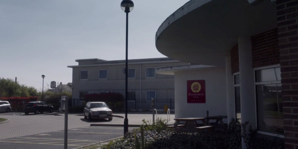
I recently completed a short project for the Sky Atlantic series The Tunnel, 'a British-French crime drama'. With the third series Vengeance soon to be released, Toby Welch (friend and producer of the show) reached out for some help filling some gaps in post-production.
Usually (in Britain anyway), if a brand is used on a TV show, then the makers have obtained express permission to use it. I once met a graphic designer who worked on a well-known ITV soap, whose job it was to create fake drinks labels of all the spirits behind the bar, because using the real ones would have been a legal nightmare. So when we film an exterior shot of our protagonists driving up to a cheap, road-side hotel and pulling over outside, we can't show the real name of the hotel. We have to come up with a fake one. And when shooting a show, it's not always practical, timely or cost-effective to make real signage for a wall or the side of a building. It's often cheaper to digitally add it later in post.
The brief.
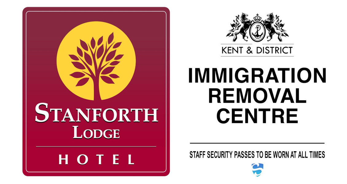
Toby needed two logos for the VFX team to superimpose on to two different scenes. The first was for an exterior shot of our protagonists driving up to a the hotel and pulling over outside. He needed a fairly budget looking logo, and he would provide a pre-approved hotel name (signed off by legal).
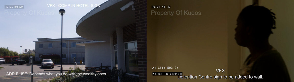
The second was for a fake institution called the 'Kent & District IMMIGRATION REMOVAL CENTRE', which needed to be in a plain, black and white style that feels like 'government' and accompanied by a private security company badge. This would be added to an interior wall that an actress would quickly walk past. I was provided with the unedited movie clips and asked to come up with some options.
This was a cool brief, which turned out to be more work than I'd originally thought.
Research.
For the hotel brand, I tried to find a colour palette that was an amalgamation of the many road-side hotels that are so recognisable as cheap in the UK. Brands that want to scream 'budget' are often orange, but hotels usually try and fake their luxuriousness with something like a blue gradient.
Without wanting to sound pretentious, it's incredibly tricky to not make the design look too good. You obviously want to submit something to the client that says, "Honestly, I'm a good designer!", but you can't, because anything too stylish or premium will be less believable in the scene.
The government sign was a little easier. The toughest part was picking a typeface that says 'government' without actually using the font on Gov.uk's website, which you're obviously not allowed to do (I actually checked). Toby had an idea of using a nautical emblem like an anchor, and I looked up Kent's sigil, which is a rearing horse.
First draft.
With a first draft done, I submitted some options...

...which were met with a pretty positive response from the execs. The next round of amends tweaked the far too intricate tree to something a little bolder. The gap between the logo and the camera would be a factor, so the logo mark for the hotel would need to stand out from a distance. Good advice for any branding project.
The immigration sign was met with approval, but the blue security logo was far more important to the scene than I'd realised. This needed some more work, and after another round of research of security firm logos, we eventually settled on these.
Approved.
As it turns out, the scene with the white wall was so hard for the VFX guys to track, that they ended up going with a much simpler adaptation in the final scene. Because there is such a wash of white on screen, with no frame of reference to track the movement of the camera, the team mocked a shorter version up onto a metal plaque. Thankfully, my corporate security logo survived.
Final scenes.
I found the whole experience fascinating. It took two days of back and forth, plus lord-knows how much VFX work, to produce signs that appear on screen for a total of less than 11 seconds. All to tell the story just that little bit better.
I think that is superb, and I can not imagine what an involved process creating an entire TV series like this must be. Hats off to Toby and the team. Fingers crossed I get more work like this. Graphic design for TV and Film. It's a dream job.
P.S. Check out this video from Annie Atkins and her work for the Grand Budapest Hotel.
Dribbble Animations
I finally got an invite to Dribbble! (follow me here)

I finally got an invite to Dribbble! (follow me here)
For the uninitiated, Dribbble is (in their words) a 'show and tell for designers'. It's basically an online community for design pros who want to share their work and maybe ask for feedback, or basically show off. It's pretty powerful, and can actually lead to paid work.
There are lots of posts about branding and logo design on Dribbble, and the ones that do really well (make the front page) are usually the ones that show a little gif animation. Sometimes it can really sell the story of a brand.
From my experience making banner ads and some video editing, I can do a pretty decent job of animating, starting in After Effects and then moving to Photoshop to make a lightweight gif. Here's a selection of posts I've made from some of my logo designs over the years.


I got to judge an award
After winning Best Use of Technology last year, The Cateys asked me back to help pick this year's winner. The Cateys celebrates the achievements of the best people, places and businesses in the hospitality industry, and takes place each year at Grosvenor House in Mayfair, London.
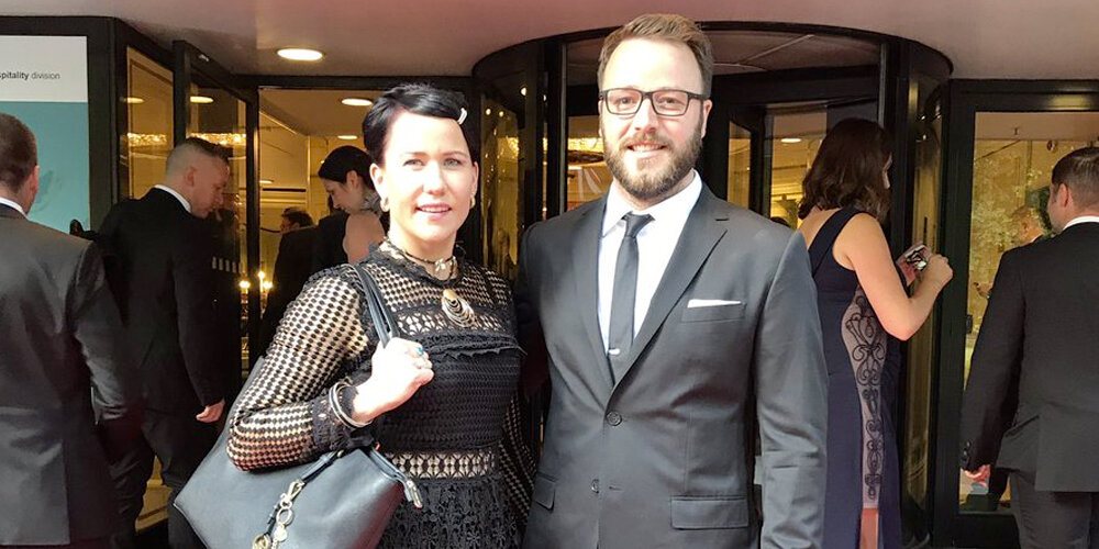
After winning Best Use of Technology last year, The Cateys asked me back to help pick this year's winner. The Cateys celebrates the achievements of the best people, places and businesses in the hospitality industry, and takes place each year at Grosvenor House in Mayfair, London.
I won the award in 2016 with my client M Restaurants, after I implemented our 'clever use of disruptive leading-edge technology' in the form of a Choose Your Table feature on mrestaurants.co.uk (more on this here).
Award ceremonies are a dime a dozen in London. I've been to a lot of dos, especially in the creative and publishing industry, at some of which as many as 50 awards are handed out. They're long evenings, and with that many awards it's sometimes tempting to think that the judging process isn't really taken seriously, and not much care actually goes into picking the winner.
What I got to experience in April was how judging an award like this works, and how wrong I was about the process. The criteria for winning a Catey is seriously tough. There were nine of us on the panel, consisting of industry experts and ex-winners. And we had eleven award entries to whittle down to one, almost every one of which had submitted a hefty entry essay and supporting documents.
It's a lengthy process, and winning the award is no small feat. Not just because the number of other entrants is high, but the judging has a high level of scrutiny, and as we went around room and discussed each entrant in detail, I couldn't help but feel proud for winning the previous year.
After a very spirited (and enjoyable) debate, we narrowed down to a shortlist and finally a winner, with a show of hands. You can read about the eventual winner, Pizza Express here, who implemented a Facebook Chat Bot to handle their social reservation system. I was lucky enough to be quoted in the article...
“The team spotted a gap in the customer experience and empowered the user, all under an impossibly tight timeframe and a minuscule budget.”James Barnard


...how great is that!? And to top the whole thing off, I was invited to attend the awards ceremony and dinner in Mayfair with my wife Laura.
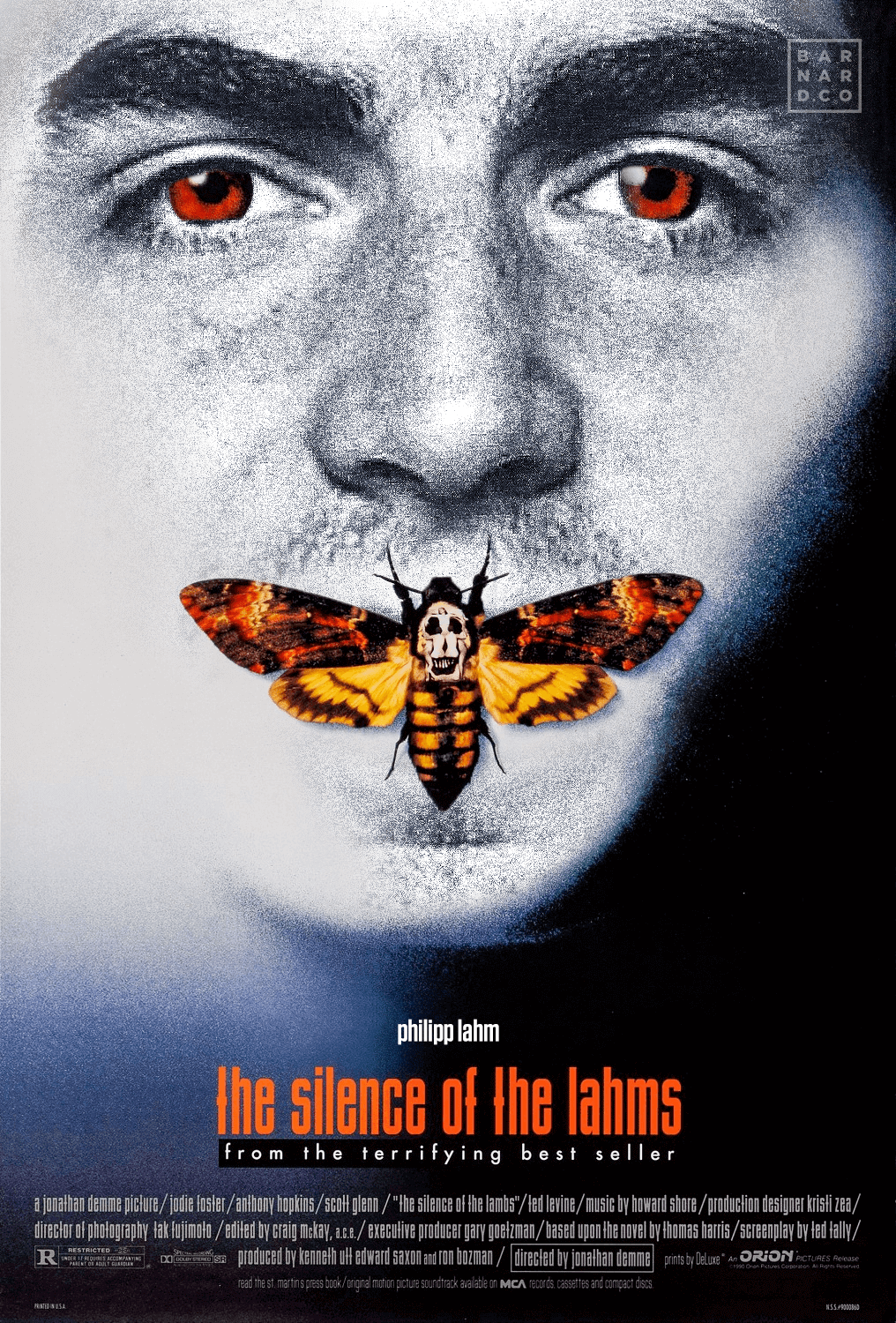
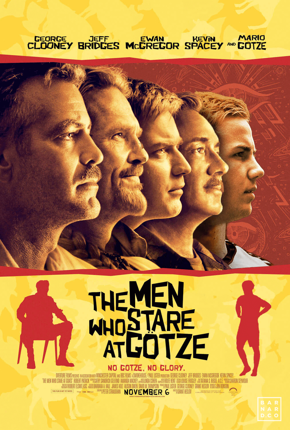
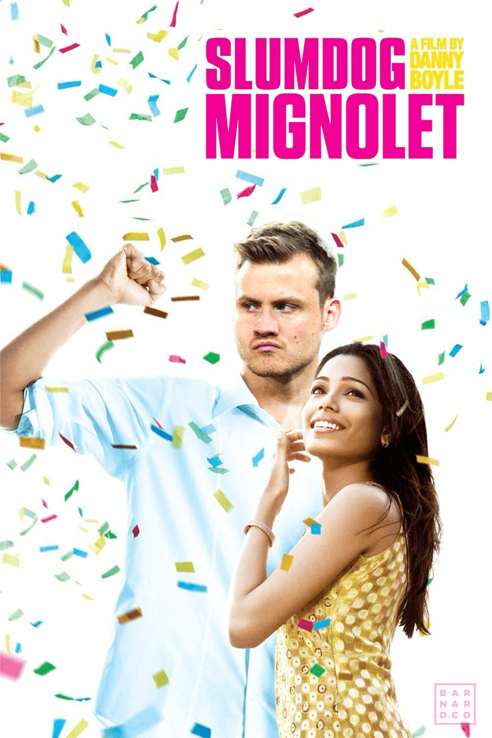
Filmballers
While watching the Premier League this year, two of my friends came up with a great game. Basically, you substitute a footballer's name into a movie title and make it as funny as possible. It's called Filmballers.

While watching the Premier League this year, two of my friends (Steven Bradshaw and Paul Child) came up with a great game. Basically, you substitute a footballer's name into a movie title and make it as funny as possible. It's called Filmballers.
I'm nowhere near as good at this game as those guys (my football knowledge lets me down). The best I could muster were lines like Suarezevoir Dogs, or The Big Lewandowski (terrible). Our WhatsApp thread contained some absolute corkers though, and failing to make much of an impact, Steve suggested a fantastic way for me to contribute.
So I present below, 20 of our greatest Filmballer lines (mainly from Steve and Paul), mocked up in Photoshop as posters by yours truly. Plus, I made a little time-lapse video of the making of 'Brave Hart'. Enjoy!