
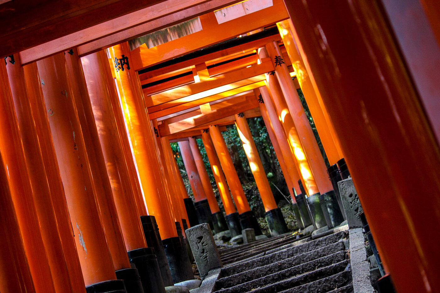
How I launched a website in a day with Adobe Muse.
I own a copy of Adobe Muse as part of my Adobe CC subscription. I've wanted to try it out for some time, as it claims to put the power of the web developer into a designer's hands.
[Edit: See the site live at odibeesans.com]
I own a copy of Adobe Muse as part of my Adobe CC subscription. I've wanted to try it out for some time, as it claims to put the power of the web developer into a designer's hands. Essentially, you can theoretically turn your design (done in Photoshop or similar) into a fully-functioning, responsive website, without having to write a single line of code.
I've always been suspicious about programs like this. The worry for me was that programs like this will spit out unnecessary, bloated code, and will never do as good a job as a developer. So I decided to spend no more than a day learning to use the software, and to see if I could actually build a working, one-page website using Adobe Muse, and publish live to a domain.
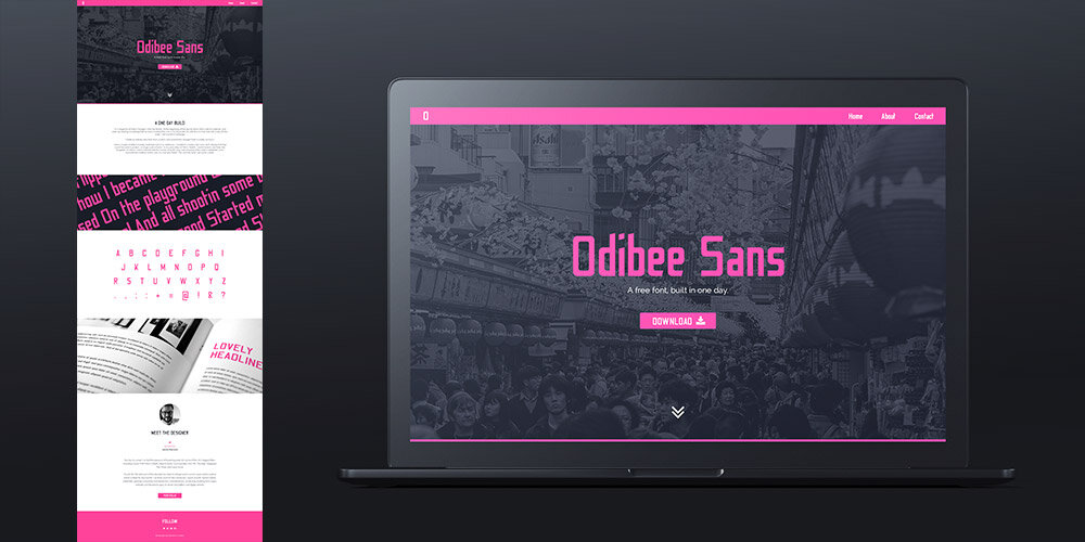
My project would be to create a website for my font, Odibee Sans. I made this font in one day (a one day build or 'ODB'), so making the website to accompany it in one day seemed fitting.
I went to Photoshop and began laying out the design for my one page website. Obviously, I wanted the site to be responsive (look good on mobile) so I kept it as simple as possible, with a three-item menu and centred content throughout the page (no need to stack elements on smaller screens). It would need a little intro copy, some information about me, the designer, and a link to download the font. Also, the website would need to host my custom font, to be used as headlines across the page.
With the design done, I went to Adobe Muse and started off watching the program tutorials. There is an excellent resource here for beginners, which guides you through the whole process of building a responsive website in Muse.
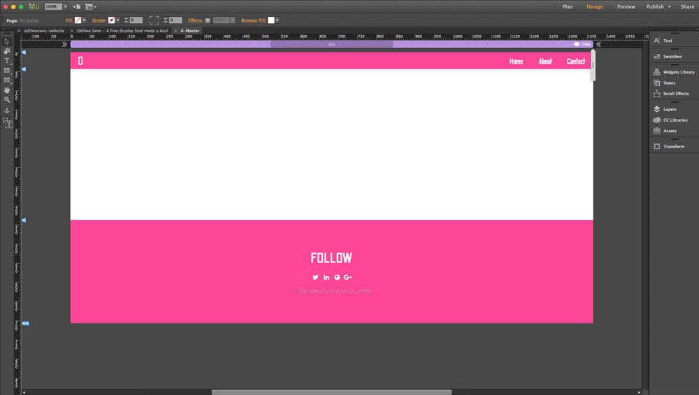
You begin by setting up a master file. This contains any content that will be displayed across all pages on the site, or in our case, the header and footer. You can import Photoshop elements layer by layer, which is super handy for inserting items like full-screen images, or png buttons. What's also handy is importing your entire document as a flat guide to build on top of. However, I found that it was easier to prepare my assets using the 'generate assets' feature inside of photoshop, and then import them manually. This is where you just type '.png' at the end of a photoshop layer and it creates a png file for you in a separate folder. I use this feature all the time when I make email newsletters and it allows me to also control the file size of each asset. For example, if I want a jpg at 70% quality of the original, I simply type '.jpg7' at the end of the layer!
I then had to insert the custom fonts that I wanted to use on my site. My design only used three fonts; my 'Odibee Sans', the Google font 'Raleway' and the wonderful 'Font Awesome' for icons. But unfortunately none of these were standard system fonts, and they all had to be uploaded to Muse, which is then hosted within the final export.
With the background colours and text inserted for my header and footer, I then had to set rules for each element so they stay in the position I want them in as the browser resizes. For instance, I always want my menu items to be fixed top-right of my screen, but the footer elements should stay centred. This takes some trial and error using the 'pin' and 'resize' settings in Muse.
With the header and footer created, I moved to the home page design via the sitemap in Muse. There wasn't much of a sitemap in my instance, as it was only one page, but this is where you can create multiple pages for your website. My menu therefore, would only use anchor links to certain sections of the home page.
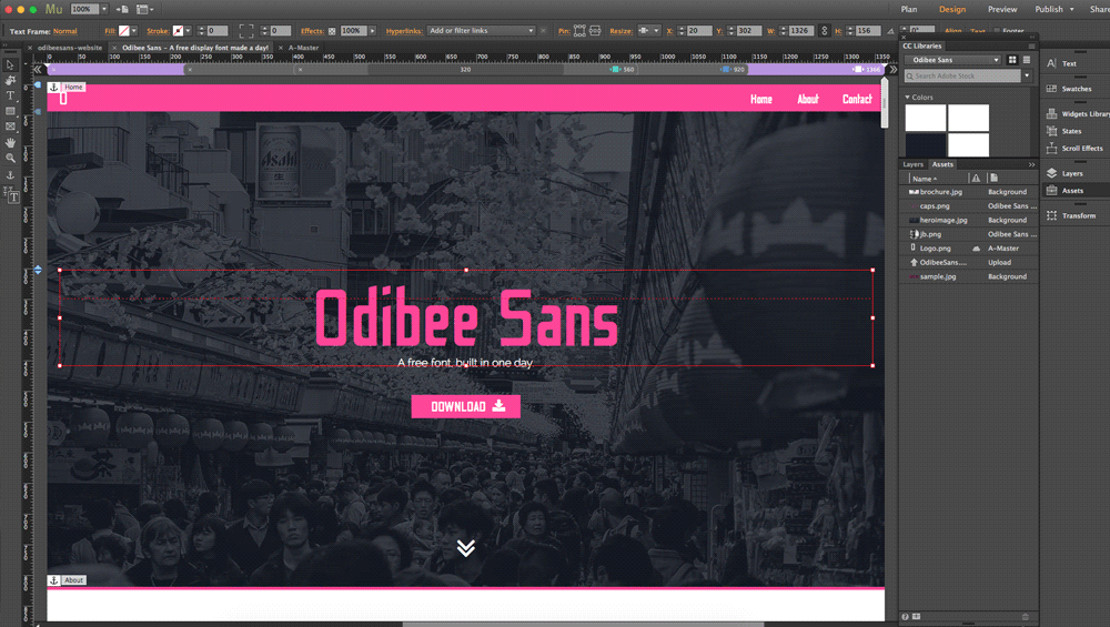
From here it was just a case of exporting my assets from Photoshop and inserting them into Muse. Luckily (because I'm super-organised) I had already set my styles using the CC libraries in Photoshop, including all colours and fonts. So when I went to set the styles for links, 'h1' and paragraph tags, all I had to do was click the button in the libraries panel.
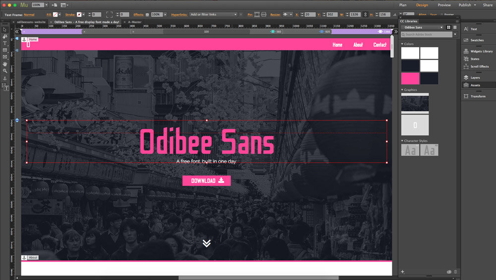
The hard part was telling Muse what should happen as the browser resizes. I wanted my hero image to fill the width of the browser, but not scale on resize, so that it remains centred. This took some figuring out. Essentially, you create a rectangle with an image 'fill' of 'heroimage.jpg', and then set the fill to 'Scale to Fill'. More on this here.
I then decided on my breakpoints for the site. This is the browser width under which the content should change, and luckily this is super-simple to set up in Muse. You just drag the width of the page until the site 'breaks' (e.g. the content spills off the edge or the design no longer works for that screen size) and click the little plus symbol at the top of the page. Then simply move or resize the content until it looks nice. I only needed three breakpoints; one for when the text was too wide for the browser, and one for when the main title 'Odibee Sans' no longer fitted the screen. Everything else either scaled to fit, or was already designed to fit on a mobile screen (e.g. the header and footer).
With the site previewing well in my browser and looking good on mobile screens. I created my anchor points on the homepage (Object > Insert Link Anchor). Amazingly, Muse includes a beautiful scroll feature, rather than 'snapping' to a point in the page. So when a user clicks a menu item, the page scrolls nicely down to the correct section. I then styled each and every hover state for my links, and added 0.2 second fade to each hover, which is a lovely control feature.
After testing the site like mad in browser (option+command+E to preview) I was ready to publish. I already owned some hosting space and mapped my freshly bought URL from Godaddy (I won't go into this here). All I needed now was to add my ftp details into Adobe Muse and hit publish! This is an excellent feature and one which I've used before in Dreamweaver, as it saves you having to export the files and upload manually via an FTP client. It also means that I can make live changes whenever I want directly in Adobe Muse and the software will only update modified files whenever there are changes.
I was blown away with how fast the whole process was. I went from design to live in about 5 hours! But this only took so long because I was using the software for the first time. As an Indesign user, the keyboard shortcuts are very similar, and after watching the tutorials I was flying around the software. Also, adding Google Analytics, metadata and favicons was super simple.
Check out the site live at odibeesans.com and download my font for free!
Cinemagraphs and 'Saber'
This was about 5 minute's work. How amazing is that!?

Type guru and former art director of Men's Health Kerem Shefik (an old work colleague of mine), posted this on Instgram a short while back. He used the free Saber plugin for After Effects to make an animated letter 'O'.
A post shared by Kerem S (@kerumba) on Mar 7, 2017 at 2:58am PST

“I get to be the Sith Lord!”
Pretty much immediately I downloaded the plugin and started messing about with it. It is unbelievably fun to work with, and has a ton of different settings for different 'energy' styles, commonly seen in lightsabers, but also wizard (Patronus) effects used in Harry Potter.
Last year our wedding photographer Chris Giles captured this image of my wife and I mucking around with his lights...
The glows from the lights in this picture are so good that I thought I'd replace the lights with some saber effects and create a cinemagraph. I removed the lights as best as I could in Photoshop, and changed the angle of the red saber to point above Laura's head. There are presets in the plugin that require very little tinkering, and I was able to very easily create Luke's blue lightsaber and Kylo Ren's red one (minus the hand guard). I exported a 4 second video, and then merged 2 seconds over the top so that the video seamlessly looped. After converting it to a gif I was left with this!

This was about 5 minute's work. How amazing is that!?
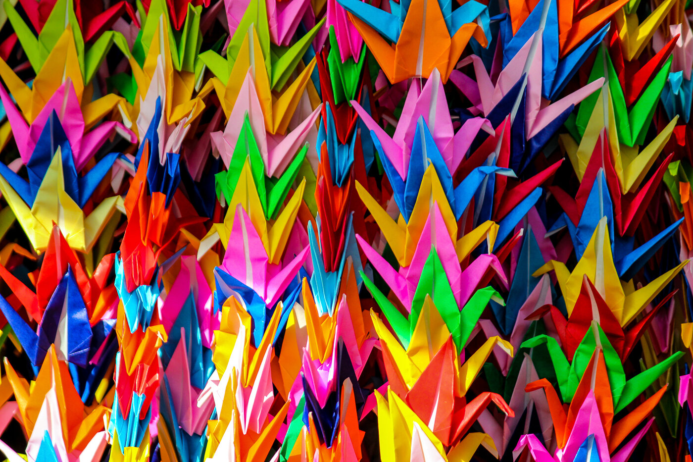
I made a font (from scratch) in one day
It’s finally live on Google Fonts! You can find it here.

[EDIT: It’s finally live on Google Fonts! You can find it here.]
One Day Builds
I’m a huge fan of Adam Savage’s One Day Builds. At the beginning of the day he starts with a pile of materials, and ends up holding something that he once coveted (this one is my favourite).
So with this in mind (and a day off from work), I set myself a challenge…
Create an entirely new font, from scratch, and submit it to Google Fonts in under 24 hours.
I had a couple of letters already sketched out in an old notebook. I wanted to create a tall, sans-serif, display font that could be used in posters, or large scale artwork. In my early days at Men’s Health, I would have to use fonts like ‘Tungsten’ or ‘Heron’, which were terrible for chunks of body copy, but amazing when used in headlines, or for promotional material (which was my main job there). This was the style I set out to create.

1pm, Wednesday
I went straight to Adobe Illustrator with the two or three letter styles I had sketched out. I set up five grid lines on my artboard, one each for the descender line, baseline, x-height, cap height and ascender line. I then decided on a width for the capital letters, and from there, the thickness of the stem (e.g. the width of the letter I).
I did a lot of research on letter proportions and ratios, and actually measured some existing fonts, working out how the lowercase letters should relate to the caps. From here, I made some rules:
X-height = 2 × height of ascender/descender.
Stem width = 1/4 capital letter width
Lowercase width = 3/4 capital letter width

From here I created the letters O and B first. I made a decision that any letters that would usually have curves, would have a rounded corner instead. Most letters would be a tall block shape, but with letters like O, B and D, the edges with curves would have rounded corners. The outside corner would have a 12mm radius, and the inside had 6mm. With these rules agreed, plus a height for my crossbar (across the letter H) I started churning out my capital letters.
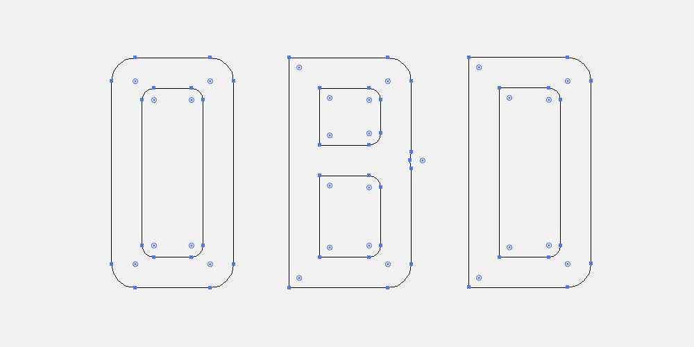
My font was very simple, but with one defining 'flourish', if you will. Any aperture, which is the opening in a letter, like the cut in the letter C, or the end of any arc, like the curved end of the letter J, would be cut at an angle. The hardest letters here were G and K.

With the CAPS completed, I moved on to the lowercase letters. This was undoubtedly harder, but with my rules agreed upon, it was just a case of churning through them. I used a lot more of my 'flourishes' here, especially at the end of the ascenders and descenders. The letters f, g, a and e were the trickiest, as they were completely new styles.
9am Wednesday

I was now moving on to some of the extra glyphs, like the question mark and exclamation mark. My pace picked up, and before bed I had managed to work up around 35 of them.
Thursday morning
In the morning, I completed the numbers 0 to 9 pretty quickly, and then began to actually create the font file.
This was completely new territory. Ian Barnard, a calligrapher pal on twitter (with my surname), recommended a program called Glyphs, which you can download for a free 30-day trial.
I downloaded Glyphs Mini and watched a couple of tutorial videos, then realised I’d set up my illustrator file completely wrong. So I had to paste each character in manually and scale it up to match the guides in the app.

10am, Thursday
With my characters in place, I went about spacing and kerning the letters. This part was incredibly time consuming. There are a series of keyboard shortcuts in this app which you absolutely must master before setting out on this. And before starting the kerning process, you have to get your letter spacing as close as possible to how you want the file to look.
Apparently as a rule of thumb, measure the width of the counter of the letter O (the hole in the middle) and divide that by three. That is the spacing distance you should start with on the left and right side of your letters.
11am Thursday
With the spacing set up (accounting for wider letters like M and W) I started kerning. This was a massively painstaking process. I visited this website, and pasted in their example kerning text.
Using the keyboard shortcuts (use this tutorial) I plodded through and adjusted kerning groups for every single distance that didn’t look right to me. The obvious ones are between V and A, but there are so many letter pairings within that example copy that I wouldn’t have thought of.
Once complete, I converted the kerning text to all caps and did the whole thing again, to pair the capital letters.

12:59pm Thursday
I exported my font and converted it to a .ttf file ready to submit to Google. With quite a few glyphs still missing (like square brackets and copyright symbols), I was certain that it wouldn’t be accepted. I also didn’t have time to include the multitudes of accents required for full language support.
It’s not the greatest of fonts, but it wasn’t bad for my very first go. And considering I had to teach myself how to use the Glyphs software from scratch, and it was completed in a single day, I was pretty proud!
The name?
Odibee Sans
…pronounced “oh-dee-bee”. My very own ‘One Day Build’ (ODB).

Afterword
I submitted Odibee Sans to the Google Fonts team back in May 2017. The team quite rightly suggested that I should spend some additional time on the font to refine the design (although they admitted that this was against the spirit of the project).
With this in mind I spent an additional day on the font. I have since added all the extra glyphs (I think) required for extended latin support. I also made some major changes to around 30 of the glyphs, including new styles for the letters (caps) S, B, R, and lower case s, c, y, a, e, r, f, t, p, q and j, as well as a couple of number tweaks.

On top of this, there are now more than 1500 kerning pairs, which has made a massive improvement to the typeface.
And I made a website! odibeesans.com
The site was also made in a day using Adobe Muse. More on this here.
Thanks for reading! I’d love to read about any projects you may have tackled in one day. It’s quite an effective technique, if you can spare the time (God bless the freelance lifestyle)!
Press:
Medium (published on Freecodecamp)
The Next Web (syndicated article)
Design Taxi
The League of Moveable Type Newsletter (and podcast)
Adobe Illustrator (tweet)
Adobe Create (tweet)
Font Squirrel
Digital Arts
Web Designer Depot
Freebie Supply
Befonts
Flexible (dribbble)
Free Design Resources
Batch editing in Lightroom: My Japan Trip
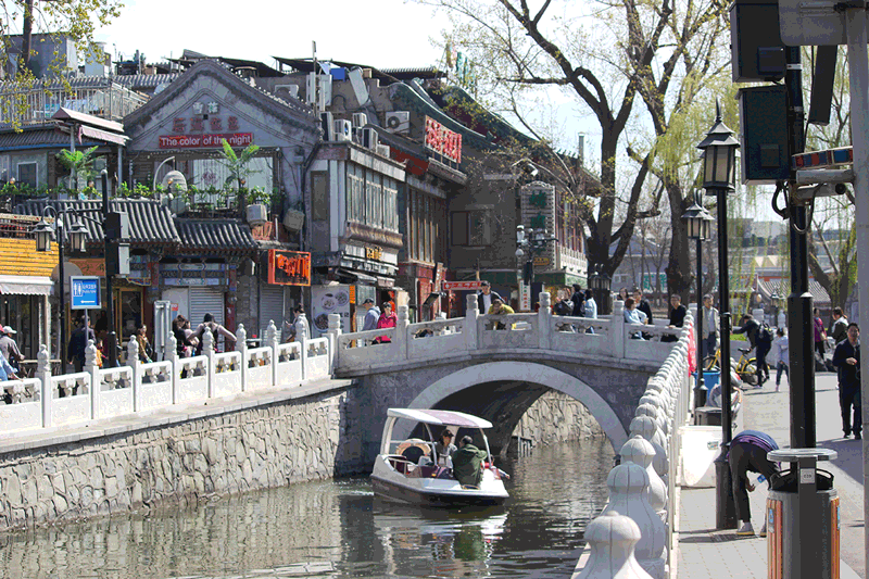
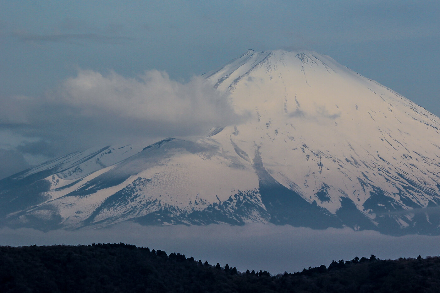
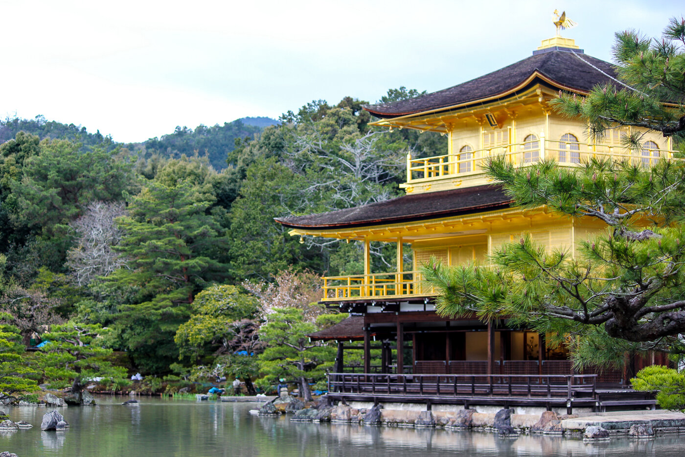
In April, I fulfilled a lifelong dream and took a trip to Japan. I took along my old Canon 550D, with a new 55-250mm zoom lens and did my best at capturing our trip.
In April, I fulfilled a lifelong dream and took a trip to Japan. My wife and I actually spent a few days in Beijing on the way over, and visited the Great Wall. We then flew to Tokyo, where we caught the bullet train and visited Kyoto, Hiroshima and many other wonderful locations. I took along my old Canon 550D, with a new 55-250mm zoom lens and did my best at capturing our trip.
Japan is one of the most photogenic places I've ever visited. The mix of the ultra-modern and pristine ancient landscapes is unbelievably captivating. But because we were on the go so much, I shot pretty much the entire trip using the 'full-auto' setting on the camera. While this does a pretty good overall job, it simply doesn't sell the vibrancy of the colours we experienced, and on particularly dull days a lot of my pictures were fairly lacklustre.
I would usually edit my snaps in Photoshop. However, I took over 1500 pictures on our trip, and processing each and every picture here would be painstaking. I also needed a way to quickly cull or crop a vast majority of these pictures. So, using Adobe's Lightroom (for the first time in my career!), I set out on the task of batch editing all of my pictures.
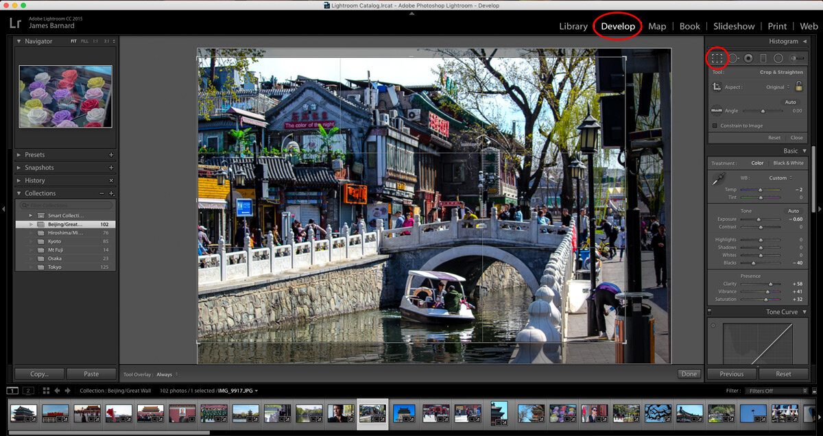
Step 1. Crop & Straighten
With my files imported, I hit the Crop Overlay tool under the Develop menu. From here I straightened and cropped my pictures either to look more centralised, or to put points of interest into the 1/3 area of the picture, using the guidelines. In this example, I moved the centre of the bridge into the bottom-right third of the crop.
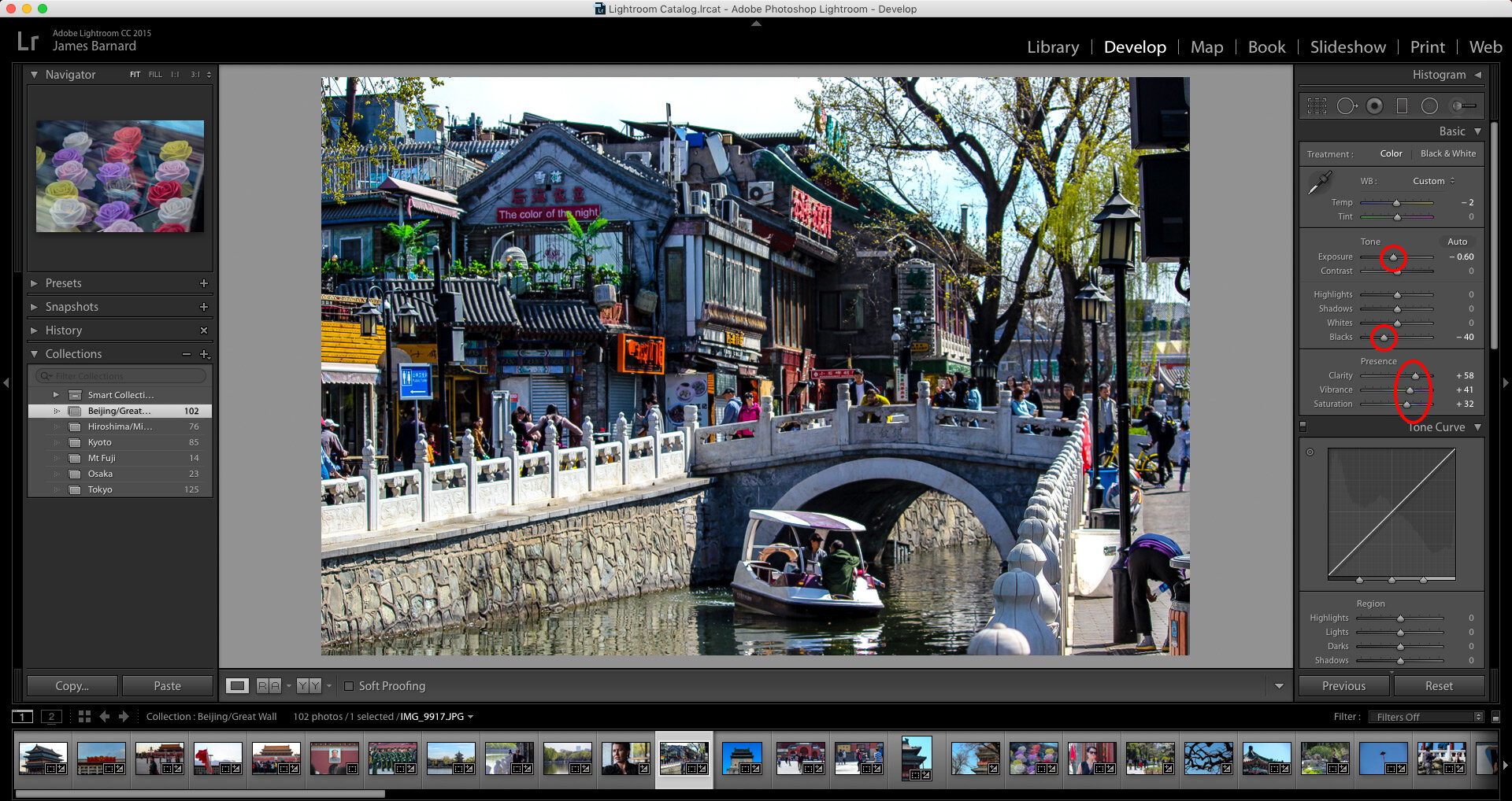
Step 2. Colour Treatment
Most of the shots in my library were massively over-exposed and had a crappy white balance setting. So I brought the exposure down and reduced the blacks setting. Then, I highlighted any colour in the image by increasing the clarity, vibrancy and saturation of the picture.
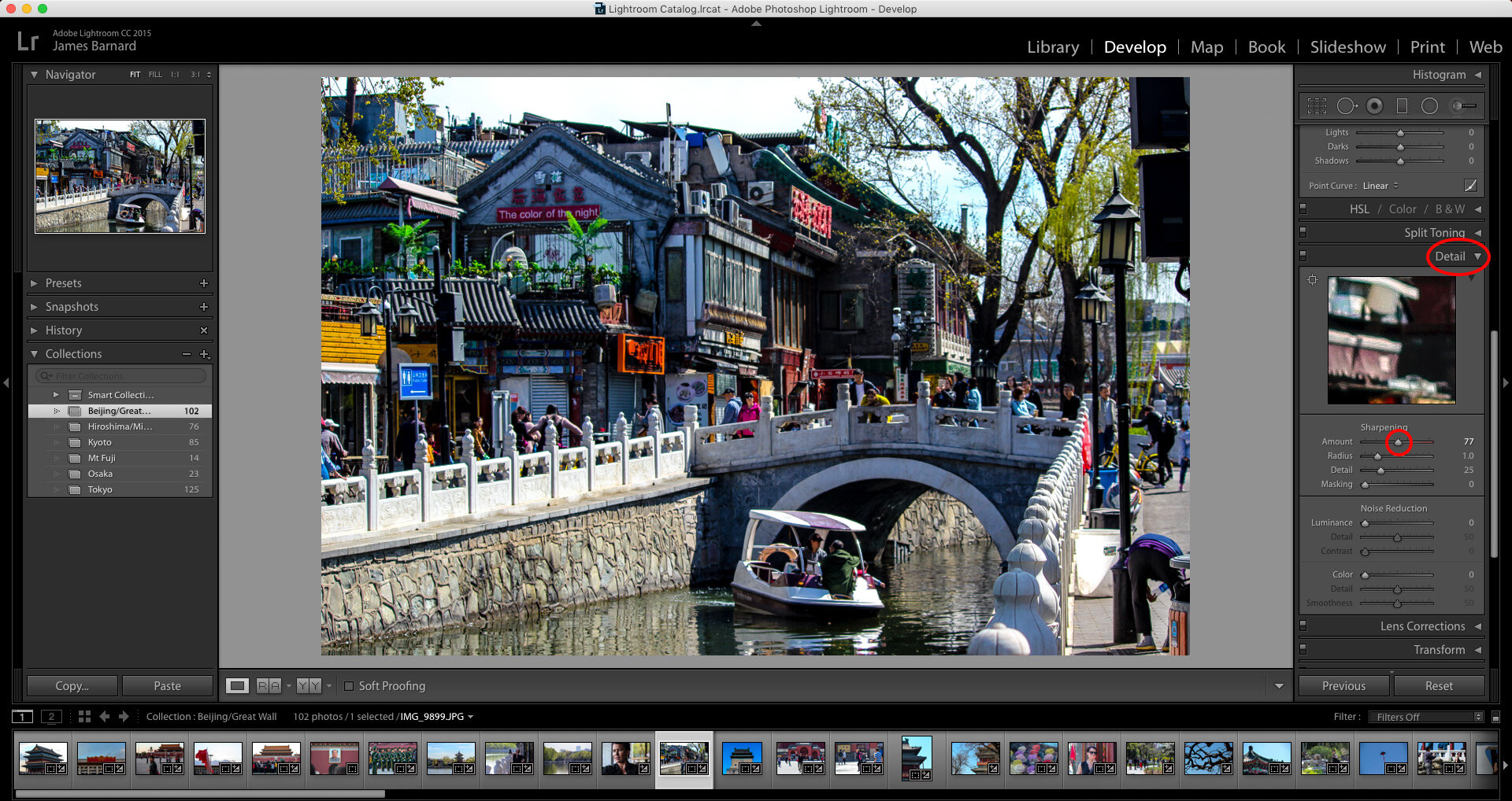
Step 3. Sharpen
These images were mainly going to Facebook, so to increase any detail in the image (handy for online viewing) I sharpened the image a touch. This can be found under the Detail menu.
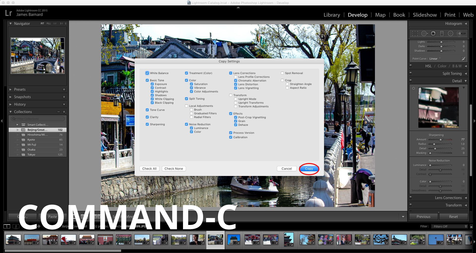
Step 4. Copy and Cull.
With these settings complete, and still under the Develop menu, I simply hit Command-C to copy the settings, and Command-V to paste them onto the next photo. This is a huge time saver. Each photo had to be cropped again, but the colour and detail settings can all be copied directly to the next pic. Obviously, the colour and sharpen settings also need to be tweaked for each picture (especially the saturation). I actually combined my DSLR shots with some iPhone pics I took, and these had massively different needs.
While progressing through my album, I deleted photos as I went. You can remove pictures from Lightroom only (option-backspace), so you're not deleting any originals, and from my original 1500 I managed to ruthlessly select around 200.
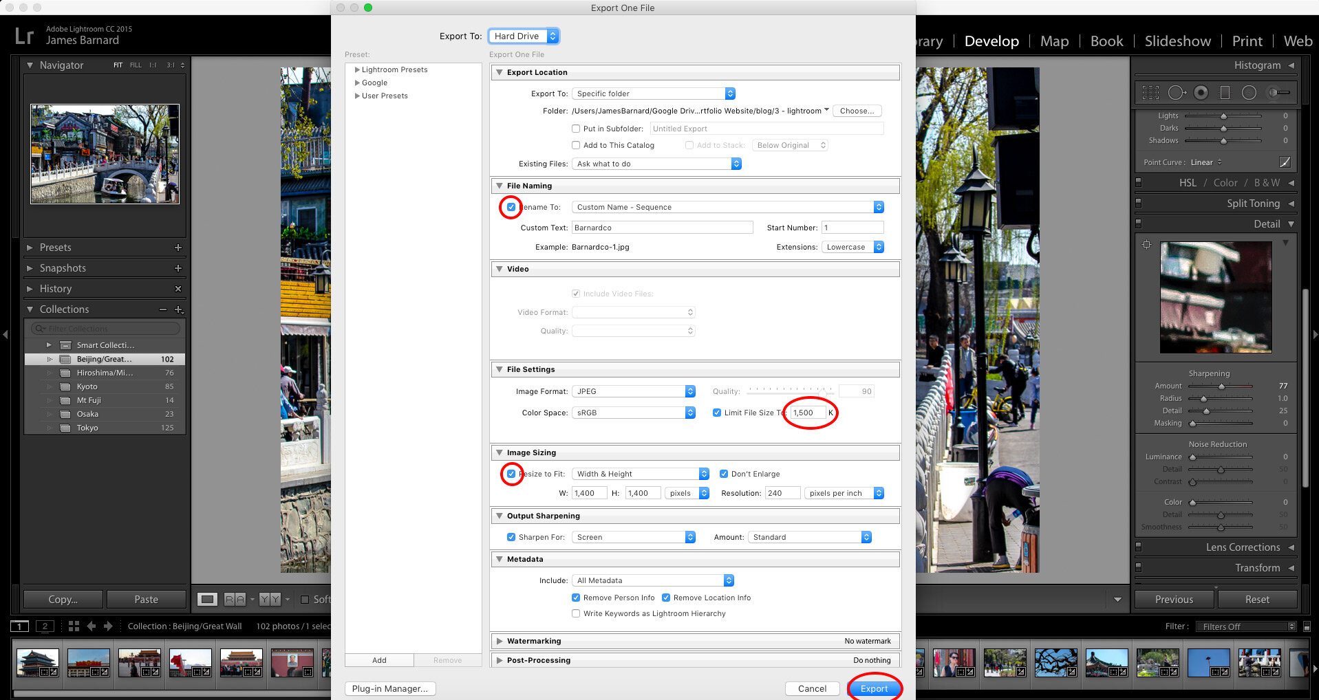
Step 5. Export for Screen
With my pictures chosen and edited, I went to export them (select File - Export). From this menu, I renamed the new shots, and made sure that they wouldn't unnecessarily take up too much size on my computer. I limited the file size to under 1.5MB each (still pretty large) and brought the height and width down.
Results.
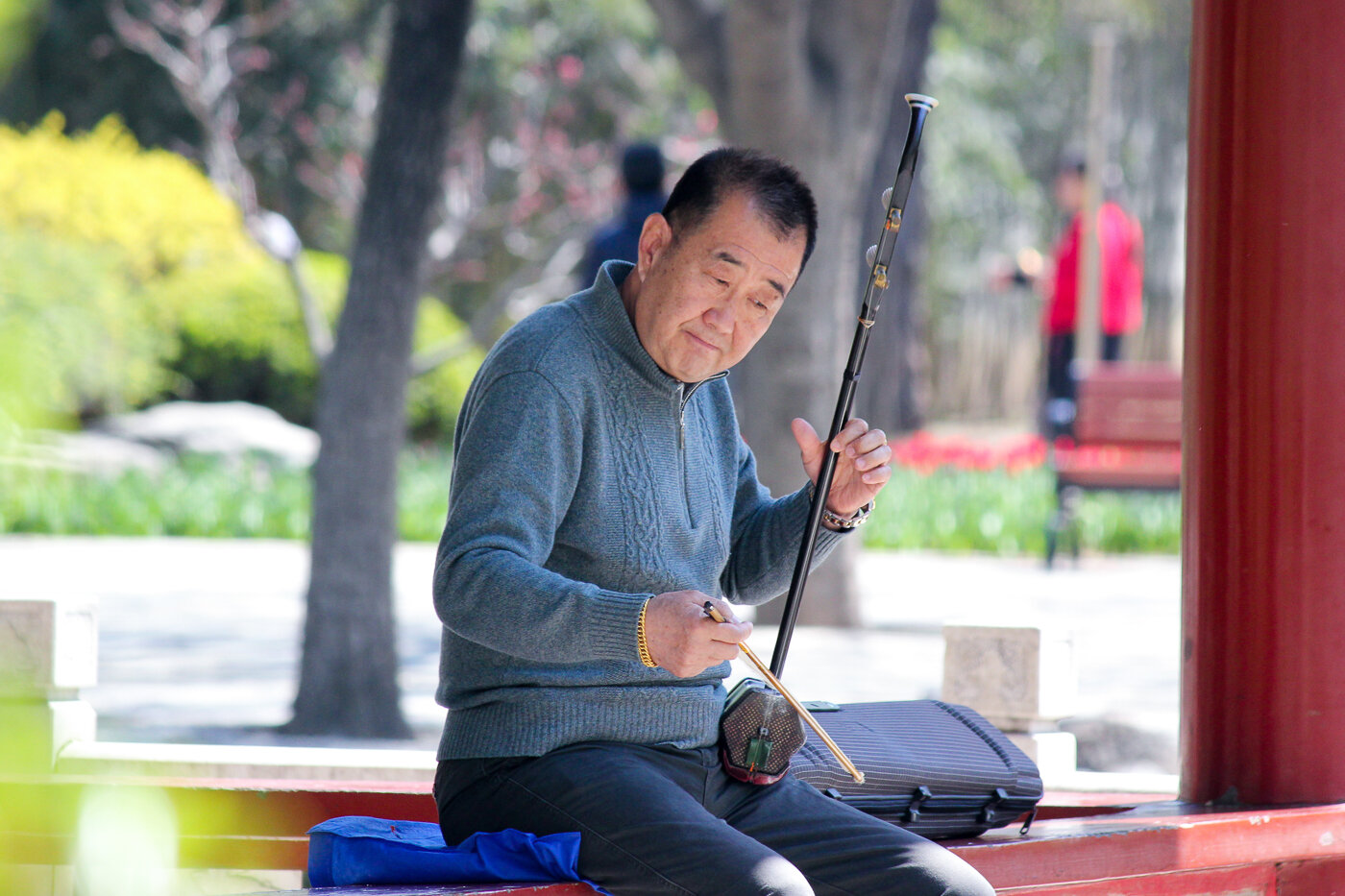
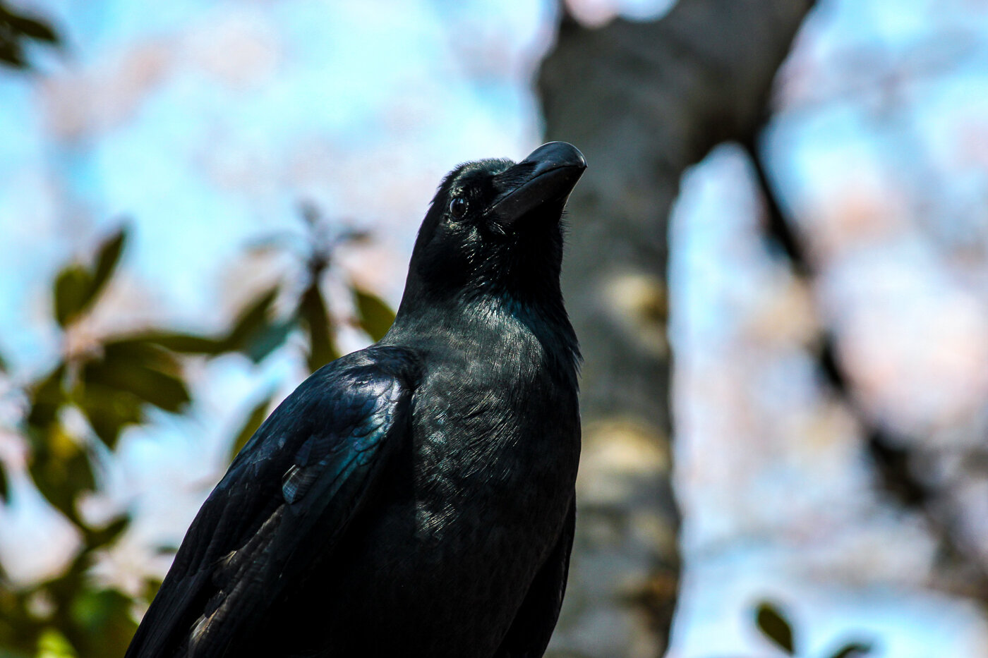
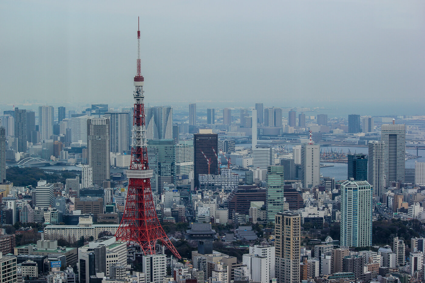
Here is a selection of shots I'm particularly proud of. The whole process was a huge amount of fun, and most-importantly, a huge time saver.P.S. Go to Japan. You won't regret it.

My doppelgänger in Northern Irish politics
A couple of weeks ago I found myself on the homepage of the BBC News NI website, after I tweeted the leader of the Social Democratic and Labour Party in Northern Ireland.

A couple of weeks ago I found myself on the homepage of the BBC News NI website, after I tweeted the leader of the Social Democratic and Labour Party in Northern Ireland. This is my third time going viral, and each time is no less exciting (and mental). The first was after I wrote a letter to Nestle. The second was for a guide on how to make your own wedding invites. But this one escalated so quickly that it made my head spin.
On the 22nd Feb 2017 I was sent a picture of the leader of the Social Democratic and Labour Party in Northern Ireland, Colum Eastwood. He was running an election campaign for a seat in the NI Assembly and all over the TV in the UK, which is where my friend Luke spotted him and sent me this...

When I showed this to my wife, she asked where the picture was taken as she'd just assumed it was me. From this angle, we look almost identical. So I had a little fun with the web camera and tweeted him some pictures, asking if he needs a body double:
Saw @columeastwood on TV last night and god we look similar. Let me know if you need someone to play you at parties! #doppleganger pic.twitter.com/JJBbftJOPb
— James Barnard (@barnarddotco) February 22, 2017
When Colum himself retweeted it, a journalist at BBC Radio Ulster got in touch, and then that evening this article appeared on the BBC News NI homepage, as well as getting a mention on the radio.

Then everyone in Northern Ireland had a little fit...

...and now I've got a new buddy! Honestly, the whole thing was a bit silly. But it was a lot of fun meeting Colum, if not a little weird. We were genuinely laughing our asses off, and his campaign team took a short video, which again made it on to the BBC website. I posted the whole thing to image site Imgur, and it made the front page, getting around 150,000 views in a day. Check it out here: http://imgur.com/gallery/ofQbC

Press:
BBC News: NI Assembly election: 'Newsnight' and Eastwood double
BBC News: SDLP leader Colum Eastwood meets doppelganger in London
Belfast Live: Could this Colum Eastwood doppelganger be the best lookalike ever?
Irish News: Spot the difference: Colum Eastwood has a doppelgänger
Derry Now: Seeing double! SDLP Leader Colum Eastwood contacted by English doppelgänger
Imgur: My doppelgänger in Northern Irish politics
From Illustrator to Ink: Designing my own tattoo
process (and a little pain), but I've never had the balls to design my own.

I already have a few tattoos. I once went through an 8-hour sitting on a hangover, so I'm no stranger to the process (and a little pain), but I've never had the balls to design my own. This is for the same reason I couldn't design the logo for my freelance business; I'm my own worst critic. I'd be forever wanting to tweak and change the design, and this isn't exactly possible with tattoos.
However, I've been doodling these little geometric shapes for years now (some older examples here) and I finally decided to put my money where my mouth is and be proud enough of one of my designs to get this done. Thanks again to Marcus from Evil from the Needle in Camden who helped me through the process. We needed to make sure that the tattoo was large enough to incorporate the detail. FYI, the needle used for the line work is similar to that of a 0.6 size fine line pen, so if you can draw the intricate parts of a design with this pen, you can replicate this detail in a tattoo.


[Edit: So my brother saw this and asked me to design him one too. He liked it so much he had it done the next day!]

