Making my Dad's family (Christmas) tree
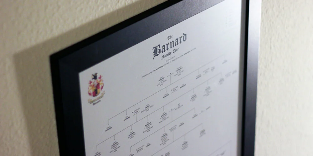
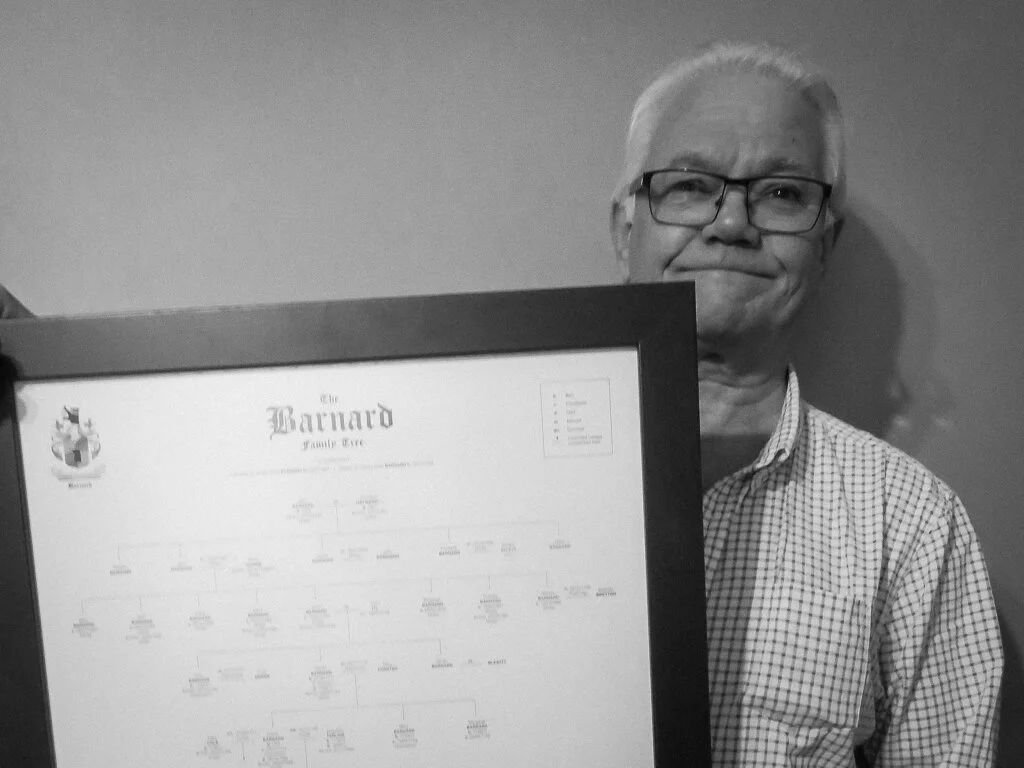
My dad researches our family history in his spare time. For his Christmas present this year, I decided to turn his research into an A2 family tree. Here's how I went about it...
I'd call Ashley (dad) Barnard an amateur genealogist, but when you trawl through birth, death & marriage certificates, search church records for baptisms, marriages & burials, hunt down newspaper entries and even look through church yards for grave inscriptions, all for the better part of twenty years, I think the title 'amateur' is a little unfair.
During this time, he has managed to trace our lineage all the way back to the year 1651.One year, he'll probably write a book on the Barnards. Until then all of his research is sitting in folders under his desk. His version of our family tree is formatted into one excel doc on his computer, where nobody can appreciate his work.
Compiling & Formatting
After my dad had sent through his findings I went about the long process off throwing everything I needed into an Indesign document. To make his excel document printable, dad had (over time) split it into 79 separate tabs. This took some sorting. Some pages were formatted top to bottom, some from right to left, and when there was no more room on the sheet, a line would point to a box that said something like 'See Barnard 2', which meant moving to another tab.
I immediately faced some decisions. There was simply no way to get the entire thing onto one, nicely framed poster. As soon as the tree hit the 1750s it branched out into multiple other family trees. The sheer number of people that this one dude spawned in the 1650s was staggering. To get the whole thing onto one A2 page I decided I would only trace my dad's lineage back to the first date. After all, this was a gift for him. This meant that I'd need to truncate the tree heavily.
Secondly, there were varying levels of detail on each entry. Some had entries like "Daniel Barnard, Farmer of South Wood", with dates for birth/death/marriage/christening; the whole works. Some only had "Died 1845/6 ?". Because of this, I decided that each entry would, at a maximum, show dates for birth, christening, death and marriage, and then place of birth and place buried only (if the research was there). Each entry would be restricted to a maximum of seven lines, which meant I could potentially format each person into equal-sized blocks, and would help with spacing later.
With the formatting loosely agreed upon, I started just throwing the people onto the canvas and drawing rough lines to work out how much content I was dealing with. At a text size of 8pt, the whole lot just fit (unformatted) on to a canvas a metre wide. Not good.
The Crest
The Barnard family crest is pretty badass. It has two bears on it. The name Barnard is apparently a derivation of the Germanic name Bernhard, composed of the elements ber(n) ‘bear’ + hard ‘brave’, ‘hardy’, ‘strong’.Unfortunately, we only have a low-res version in our possession. So I spent some time in Adobe Illustrator tracing the crest and generating a printable version using simpler colours.
This version would be used later, along with a title and a key, for the heading on the poster.
Design
After researching how to format a family tree (and not finding a definitive answer) I decided on a simple Helvetica font, with the surname as caps, and births, deaths, etc in bold. I also created a symbol that denoted a continued lineage, where the tree could no longer fit on the page. I added this to a key in the heading and began to work through formatting and aligning each of the entries.
With the format agreed upon, it was just a case of spacing each entry equally across the height of the page. There were eleven generations to squeeze on. Leaving space at the bottom for a short note to dad, I drew eleven lines and vertically distributed them. Then using the eyedropper tool in Indesign, I formatted each of the text blocks to match each other.
As I got to the 1800s, I noticed how many children Nathaniel Barnard had fathered. Starting in 1841, poor old Jane Barnard gave birth to twelve children. Sadly, it looks as though many of them died very young. Happily, the remaining offspring had eight marriages between them. However, this meant that I now had to split this generation onto two rows, as there were twenty people to squeeze onto one generational line. Therefore I had to reformat the height distribution onto twelve lines, not eleven. This meant redrawing a lot of lines and connections. Lesson learnt: measure twice, design once.
Proofing
Once I was 'finished' I went about checking my work. Not having an A2 printer at home, I set the pdf to print in 'Poster' mode (this is under Page Sizing & Handling under the Acrobat print settings). This prints eight A4 sheets with a half-inch overlap, meaning I could tape together my sheets and check that the wording was legible.
This turned out to be a crucial step, as I found a ton of typos and some formatting inconsistencies.
N.B. Even after doing this twice, I still managed to leave in an extra full-stop where it shouldn't be.
Printing & Gifting
Once done I found a nice black A2 frame and sent my poster off for printing. The result was super-satisfying, and hopefully goes some way to showing off all of dad's hard work. He was certainly pleased.


