

Making my own t-shirts
Ahead of England’s football final against Italy in the 2020 Euros (and a long way from home in Australia) I set about making my own England supporters t-shirts.
Now that I’ve moved to Australia, finding England football paraphernalia is rather difficult. And with England about to play Italy in the Euro 2020/21 finals, I thought I’d try out some iron-on transfer paper I found at K-Mart for $12.
I knocked up a design in Illustrator and printed it out on the basic inkjet printer in my office. It worked a treat! I might leave the design on slightly longer next time, as it came out with a sort of grunge effect. But I kinda like it!
The video above was pretty popular on Reddit’s Graphic Design thread, and a few people actually requested to buy it! So you can order yours for Qatar in 2022.


A Blueprint for a Logo.
Could you recreate your company logo, exactly, from scratch?

Scenario.
You’re about to present a logo design to a client when all of a sudden an EMP blast (detonated by a corporate spy) wipes every electronic device in your building.
Your meeting is in 30 minutes. If you don’t win this client, your business goes under, your other half will leave you and your kids will disown you.
Can you recreate the logo, exactly, from scratch without the ability to measure, or trace over your old design?
* * *
I often have nightmares like this. What would happen if my hard drives and cloud drives were suddenly wiped? I hardly ever print anything off. My client presentations have been completely digital since the world went into lockdown. And my initial concept sketches are… rough, to say the least.
Would I be able to replicate my own work?
I worked in advertising before I specialized as a brand designer. Often, I would be tasked with incorporating a brand into a piece of display advertising. And while I was forever perusing the brand guidelines of big brands, I was always struck most by the page with the schematic diagram. The diagram that breaks a logo down into a grid or geometric system, and shows how it’s constructed.

Schematic diagrams of logos and their construction are very popular. They are an attempt to show the geometric harmony of a brand mark, and they serve as proof that accuracy and visual consistency have been maintained during the design process. They also look really cool.
These days it’s unlikely that a designer would ever need to reconstruct a logo from scratch. But with this diagram and some simple instructions, you should be able to. And not just a close approximation. The exact logo, to the minutest detail.
* * *
I’ll assume, for my own sanity, that fitting a logo to this grid/geometry system usually comes last, after the conceptual work is done. And obviously, this blueprint for a logo only works with certain types of designs (try fitting the Coca-Cola logo to a grid system).
So I set about researching some of the world’s most famous logos. I wanted to see which logos could be recreated using a simple set of instructions, often starting only from a shape.
Let’s start with a couple of easy ones.
Starting with an equilateral triangle only, we can recreate the Natwest and Mitsubishi brand marks with supreme accuracy. And I could continue this method for brands like HSBC and Google Drive.
Too easy. Let’s try something a little harder.
I was amazed at how easy it was to recreate the McDonald’s logo. I found this design system online, but by starting with a grid of squares only, we can recreate the logo perfectly. Looking at the golden arches, you’d think that the varying stroke widths towards the top of the M would be difficult to draw. But by drawing only four ellipses, we can replicate it easily.
Moving on.
Again, starting only with an equilateral triangle, we can replicate this Adidas brand mark with a supreme degree of accuracy. Or at least I thought I could. This one wasn’t as straightforward. The 13 triangles that I thought neatly governed the ratio and spacing of the three bars, didn’t quite work. It’s pretty close, but the heights of the three bars are also difficult to determine.

Getting harder.
From the outset, the Google G looks simple to reconstruct as it appears to start from a perfect circle. But it’s not. And it is has been intentionally designed this way because of something called Gestalt theory (read this article). Essentially, our eyes will often perceive a modified circle to look more circular than a geometric one. Type designers know this, so the tail of the G has been modified to be thinner than the weight on the other side.
As much as I tried to work out a system to recreate this logo perfectly, I couldn’t. It’s too nuanced. The one in the video is close, but you can see where it falls short when you compare them.

Let’s try something with a little more history.
Designed by Bruce Blackburn as the official symbol of the countrywide celebration of the United States’ 200th birthday in 1976, this logo is absolutely timeless. Bruce also co-designed the Nasa ‘worm’ logo, and you can see his style across the two.
I found a copy of this logo on Google. However, after I had reconstructed this version I discovered that the plans for the original logo already exist. You can see on the Chermayeff & Geismar & Haviv website that the corner radius starts just past the point of the star. Not so in the version I found. So either at some point the logo was changed, or it has been bastardised over the years. Proving that schematics like this are all the more important for posterity.

When used correctly, a blueprint for a logo design can add massive value to a branding project. This is especially helpful for designers who might feel forced into justifying their costs.
It takes effort to appear effortless.
This is a mantra I use after I’ve just sent a cost proposal to a client. Designing a ‘simple’ and ‘clever’ logo is difficult. It takes a lot of experience, and sometimes weeks or even months to get right. Simplicity stands the test of time. But when you’ve accomplished an effective logo that conveys your message in a simple way, it can be easy to look at the design and say, “Well I could have done that!”.
By showing the workings behind your design in a schematic diagram, it often helps a client rationalise the money they may have just spent. It is proof that care and attention has gone into the face of their company, and it can add polish and professionalism to a presentation.
However, this isn’t a one size fits all approach. While grids and geometric design systems can govern a design, they can also hamstringing it and stifle creativity. If your logo achieves visual balance without fitting to a grid, then you shouldn’t attempt to retrofit one, or apply imaginary lines that work after the fact.

The grid can be used to tidy up a design in the last 10% of the design process. But it shouldn’t govern you completely. There’s such a thing as going too far…
Bonus: Failed experiments
Some logos I attempted to recreate simply would not conform to a simple geometric construction method. Two examples were Nike and Apple.
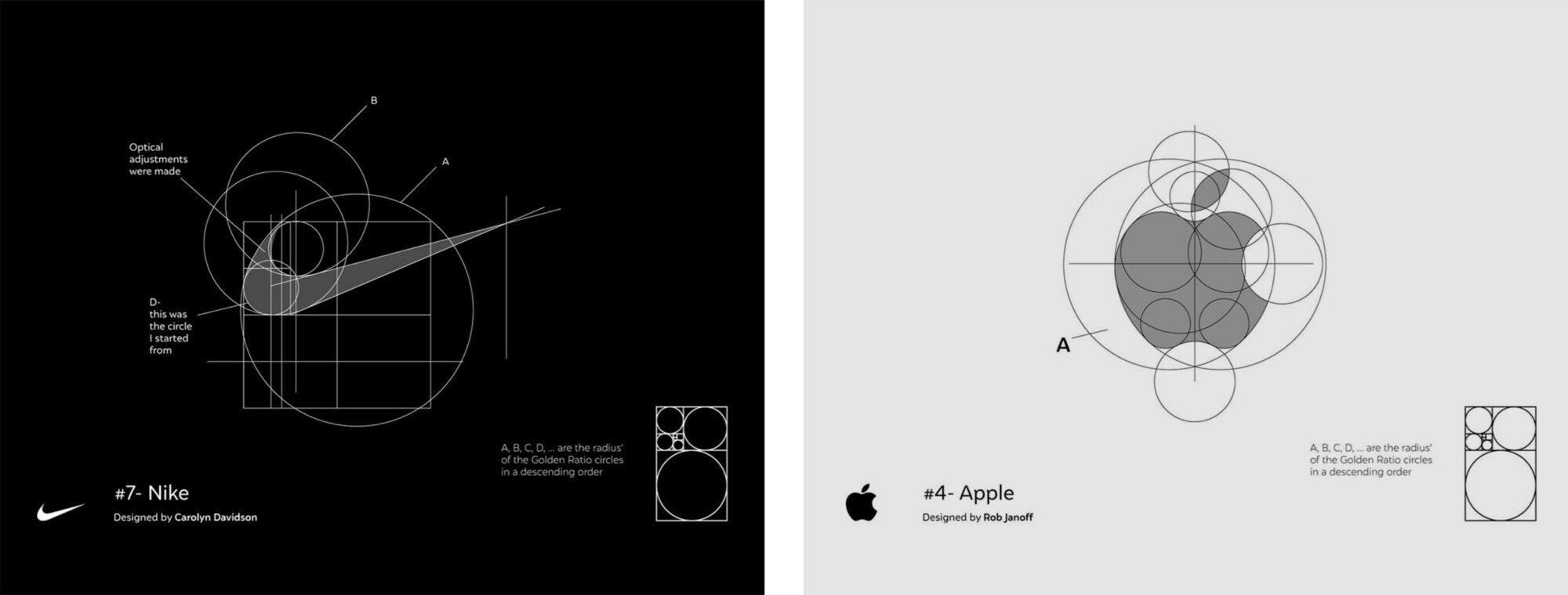
Source: The Logo Creative
I really wanted these to work. The diagrams above show the Apple and Nike logos lining up perfectly with circles formed using the Golden Ratio. But they don’t work. As good as they look, they’re not accurate and require some ‘optical adjustments’ to fit. Which defeats the purpose. I couldn’t find reference points to position shapes against to get an accurate reconstruction. They are simply too bespoke.

From the 1987 Apple Identity Guidelines. Source: Arun.is
While some designs couldn’t be tamed, others could, but were extremely complicated to recreate.
I am, and always will be, the biggest fan of the N64 logo. The colours are so distinct and recognisable, plus they coincide with the colours of the buttons on the Nintendo 64 controller. It might not work as practically these days (it’s hard to make a single colour variant) but it’s a joy to look at and the emblem fills me with nostalgia. I didn’t include this as a main example as the starting point (the diamond and their relative spaces) required measurements to replicate.
Again, the steps required to recreate the TikTok logo were too difficult. It had to be started with a specific measurement and some complicated ratios to create the corresponding circles. Not ideal for an easy construction, but still a fun process if you can follow along.
And finally, the Nakatomi Plaza logo from the building that Bruce Willis saves from terrorists in the movie Die Hard. It is another one of my favourites. But although it’s fun to recreate, it’s not accurate. The real version is actually less uniform than the one I’ve made above!
Resources/Further Reading:
U.S. Bicentennial, Chermayeff & Geismar & Haviv
20 Famous Brand Logos Constructed in Grid Systems, The Logo Creative
Should you use Logo Design Grids, Guides & Pretty Circles in your Logo Designs?, The Logo Smith
The do’s and don’ts of using logo grids, 99designs
Rediscovering the Apple Corporate Identity Guidelines Notebook Rediscovered by Arun Venkatesan, The Logo Smith

Brand For Sale: Designed in its entirety. Seeking loving owner.
Designing a fully-developed corporate identity, only without a product.

Two weeks before Christmas I was approached to design a logo for a new startup. 2020 was obviously tough for everyone, and as a freelance brand designer I’ve certainly felt the pinch. So I was over the moon when a serious client, with actual money to spend gave me the go ahead to bring their brand to life.
My pricing structure has been thrown out the window this year, and I agreed to do the job at a quarter of my usual rate. Beggars can’t be choosers. But after I presented my first round of designs to the customer, they didn’t like them.
Instead of providing feedback for another round of amends, the client did something that has never happened to me before. They cancelled the job.
I had committed a considerable number of hours to this project, and to have the rug pulled out from under me with no payment was pretty unnerving. I had forgone any deposit to get this project over the line, and now I had spent time away from my family over the Christmas period, for zero money.
Time for a new approach.
Having my work undervalued is nothing new. Ask yourself, how much does a logo cost?
It’s a tough one. I can tell you now that 50% of my job involves answering this question. And my response is different every time. If my quote is too high the client might run a mile, and if I drop my prices to accommodate, doubt and distrust starts to creep in.
Mostly, I’ll try to feel out a budget before committing too much time to pitching. And usually I’ll receive an answer along the lines of, “We can commit a maximum of £150 to this project.” As someone with more than 10 years of experience, sometimes it’s hard not to be a little offended.
So instead of clients coming to me, asking me to fulfil a brief, I’ve decided to try a change of tack and work the other way around.
Designing a brand without a client. Then selling it.
You can buy logos off the shelf. It’s nothing new. Many sites are dedicated to providing pre-made logos. And there are logo ‘generators’, where you can plug in your business name and have a series of generic icons thrown back at you.
But let’s face it, most of them suck. And in a lot of cases you don’t actually own the logo you’ve paid to use. When it comes to trademarking a design like this, you might find that you’ve paid for a license to utilise it, rather than owning it outright.

KARMR. A brand that can be yours in perpetuity for a fixed fee.
Introducing KARMR.
KARMR is more than a logo. It is a fully-fledged brand, designed in its entirety, that is ready to go. It has a website, it has a social media presence, it has marketing assets and it can be yours to use for a fixed fee.
KARMR might be a cosmetics brand, a food item, a clothing line, a startup or more. Its themes revolve around nature and spirituality. It uses a modern, minimal and abstract logomark that transitions well across multiple formats, and works beautifully on stationary, as signage and in a digital format.
And in the name of transparency, all this could be yours for £10,975:
Name
Logo
Instagram Account
Twitter Account
Karmr.io URL and website
(1 year subscription)Brand guidelines booklet
10 hours design time to customise to your specific needs
Marketing asset designs
(business card, email signature, social icon/cover photo)Launch animation
(simple 5–10 second After Effects animation of the logo transitioning onto screen, for use in web or social media)JPG, PNG, SVG and EPS file format exports
(suitable for print and web)Unrestricted ownership and usage rights
Brands-to-go as a business model.
As well as squeezing me for every last penny, sometimes my clients have a tendency to play it safe. I have tombs of unused designs that have never seen the light of day because a client has been afraid to try something a little off-piste, or didn’t trust that a colour scheme matched their customer persona.
But by creating a brand without a product, I can let a concept play out without becoming a designer sock puppet with a client’s hand up my arse. It gives me the creative freedom to see a branding job to the finish without intervention from anyone.

And the beauty is, you can take it or leave it. If it works for you, fantastic. If not, then I have created a piece of work that I am proud of, to completion. And I get to share it with the world right now. No more waiting for a launch date to add it to my portfolio.
If it sells, I’ll receive a fixed fee for work that is already completed. And whoever buys it has a zero wait time to start their business.
I work with new business owners all the time, but rarely am I in the position of creating my own side hustle. As a business model, my interim costs in this experiment are low (domain name registration and hosting costs). My main investment is time. But because I have been allowed complete creative autonomy, it’s time spent beautifully.
KARMR is a proof of concept. If it sells, then the aim is to transition into this model full-time. But I have two more brands in the pipeline. Let’s hope there is appetite out there.

Check out karmr.io for full details.
Resources:
Designing a fully-fledged brand has been done before back in 2013. Check out Hessian by Ben Pieratt. According to the website, Hessian was sold for $18,000, although at the time of writing I was unable to find the brand in use in the real world.
Logo Process Videos
During my stint in self isolation, I made some videos recording how I work up logo designs. It’s been a really fun experiment, and as it turns out, extremely popular on Reddit.

During my stint in self isolation, I used some of my downtime to develop some videos, recording how I work up a logo design in Illustrator. It’s been a really fun experiment. It not only keeps my design and concept skills fresh, but my video editing skills as well.
Take a look at some of the videos below. Some of these were worked up in a couple of hours, others took a little longer. But by setting myself a challenge to come up with topical and relevant logo ideas, I’ve managed to really up my profile in the online design community.
These videos have been extremely popular on the design channels on Reddit. And by posting them on channels like r/logodesign the feedback I've garnered has been exceptional. While most of the projects I post are conceptual, there's value in throwing up videos like this to start discussions around legibility, visual balance and the latest trends in logo design. Also, I find it useful when people explain how I could have sped up my process in Illustrator.
I'm learning all the time, and while I obviously enjoy the positive comments, I get more from the constructive feedback. It's the discussion around the designs I find the most helpful and enjoy the most.
Mask Up - Reddit Link
To everyone panic-buying toilet paper right now - Reddit Link
Celebrating getting my Australian visa - Reddit Link
Mental Health Awareness Logo - Reddit Link
One for the anti-vaxxers - Reddit Link
As it's nearly Christmas... #diehardisachristmasmovie This logo isn’t one of mine (obviously). This is simply how I would build it in Illustrator - Reddit Link
Lockdown 2 Logo - Reddit Link
Chip Chip. An entry into Reddit’s logo design battles - Reddit Link

Lockdown 2 Logo 🔑
I’m currently having to self-isolate after receiving an alert from the NHS Track & Trace app that I’ve been in contact with someone who has Coronavirus. I’m fine, and no symptoms, but I’ve been housebound for only 2 out of the 10 days and I’m already going crazy.
I’m currently having to self-isolate after receiving an alert from the NHS Track & Trace app that I’ve been in contact with someone who has Coronavirus. I’m fine, and no symptoms, but I’ve been housebound for only 2 out of the 10 days and I’m already going crazy.
With the UK about to go into a second national lockdown, I thought I’d work up a concept idea as a process showcase. Here’s a potential ‘Lockdown 2’ logo…
I posted this to the r/LogoDesign channel on Reddit (a little nervously after last time). Thankfully, everyone seemed to like it, and I even had some suggestions for a potential version2. Which do you prefer?


How do you rebrand a logo designer?
As I transition slowly into specialising in logo design, it’s time to redo my 5 year old logo.


The very first Barnard.co logo
When I first went freelance in 2015, I often worked alongside Wordpress developer Andy White. He would hire me to design websites, which he would then build for his clients. When I sent him over my first invoice… he burst out laughing.
“What the f*** is that?!”, he said.
At first I thought he was referring to my ludicrously low day rate. “Sweet Jesus, that is awful!”, he went on. And it hit me, he was pointing at my logo.
Admittedly, I had knocked it up pretty quickly as a sort of placeholder, until I could devote some real time to it. But yes, it was terrible.
A new dawn
While I was out at lunch, another designer sitting next to us, longtime friend and dev/designer unicorn Andy Styles played around with some logo ideas for me. When I got back, he presented me with what would become my company logo for the next five years.
I loved it! It was simple, it featured the domain name, it used a strong typeface and the square format lent itself perfectly to the space on my portfolio website. It also looked brilliant on a business card.
It hadn’t taken Andy more than half an hour to make, but I went about adding it to every piece of real estate I used under my company name, and there it stayed.
It wasn’t until I updated my portfolio website last month that I noticed a small issue with it. I went to add it as a favicon (the little icon next to the tab at the top of your browser), and the small scale made it completely illegible.
As a fix, I made a sort of iconised version of it that replaced the characters for squares and threw it up on the site.

You specialise in logos, right?
This favicon problem got me thinking. What better time to revamp my logo? I recently made the switch to working only as a logo designer, and as much as I love Andy’s original design, what does it say about me if I can’t claim to have designed my own business logo?
Funnily enough, simplifying Andy’s logo into a 3x3 set of squares might just make a nice looking logo. It’s a simple, bold design. I’d already proven that it scales well and it has meaning to me as it plays homage to the old layout.
So I went about perfecting it.
The Golden Ratio

The Golden Spiral
I recently read an article about how to craft designs that use the Golden Ratio. I’ve known about the Golden Ratio and its use in design layout for some time, but I’ve been seeing more and more logo designs that base their entire structure around its proportions.
For the uninitiated, this ratio (1.61803398874989…), the ‘Divine Proportion’ is found all around us. It’s in nature, in ancient architecture and mathematics (the Fibonacci scale uses it). When applied to design, it is supposed to create balanced layouts that are more pleasing to the eye. You’ll probably have seen the Golden Spiral before.
I started out by redrawing the proportions in Adobe Illustrator. You draw a square, duplicate it and lay it underneath the first. Then draw another square the height of the first two along side. Rotate all three together by 90 degrees and then repeat another square at the height of the group. Then keep going until you have as many proportions as you need. When I had finished, I ended up with this grid to use as a starting point.

All the squares grouped together and centralised.
I went about using the grid squares to reform the 3x3 favicon idea. All the while, taking care not to resize any of the proportions.

And here is the new logomark (right) compared with the old favicon version.

There’s no denying that new option breathes better. It’s hard to pinpoint why it’s more visually pleasing. Perhaps the clear space around the 3x3 squares frames the icon more neatly, or the added stroke weight to the outer border makes it bolder and more of a statement. But that’s the magic of the Golden Ratio.
I then just rounded off the corners ever so slightly to soften the whole thing a little.

The logo is so simple, surely someone has done it before?
You’d think so wouldn’t you?
I mean, it’s a 3x3 square pattern. Someone must have used this for a logo design already. But after an extensive search and Google Reverse Image lookup of my design, the closest in similarity I could find in logo format was for an app called 9square. And even then it’s only used as an app icon, which I think is broad enough of an icon design to not infringe on any copyright.
Even better, this design has so much meaning to me.
Firstly, it pays homage to my old logo, a sign that my company is evolving and improving. It’s a nice representation of a grid, something constantly used in design. It also resembles the format for the portfolio items on the home page of my website. Finally, and this bit is nerdy, it reminds me of the Rubik’s cube that forever sits on my desk. Something that I toy with when I’m conceptualising ideas for clients and to relieve a little stress.
It’s perfect for my business.
I then added the company name under the logo (appropriately spaced of course) in my favourite font Futura, which is currently used across my website. I kerned the letters a little and replaced the round full-stop with a square one to match the logomark.
Love it or hate it? Want something similar?
Did that get your creative juices flowing? If you’d like to know more about my process, or you need details of my pricing structure for your own company logo, then visit my logos pages, or just drop me an email at james@barnard.co and we’ll get started!
Edit: After I posted this animation to Reddit, I was torn apart for this logo. Read the comments, and my response here. Plus here’s a bonus Instagram post about dealing with negative criticism.


