Hummingbird
THE BRIEF
Peterborough-based digital marketing agency Web Windows was looking to rebrand to a new name. Their strategic director Tom Anderson found me through TikTok and messaged me asking for help in creating the new brand, Hummingbird.
The new agency aimed to embody characteristics of a hummingbird; efficient, streamlined and constantly in motion.
Tom needed a full rework of their company assets, including the logo, social media templates, company stationery and background assets to use across their online and print collateral.
THE SOLUTION
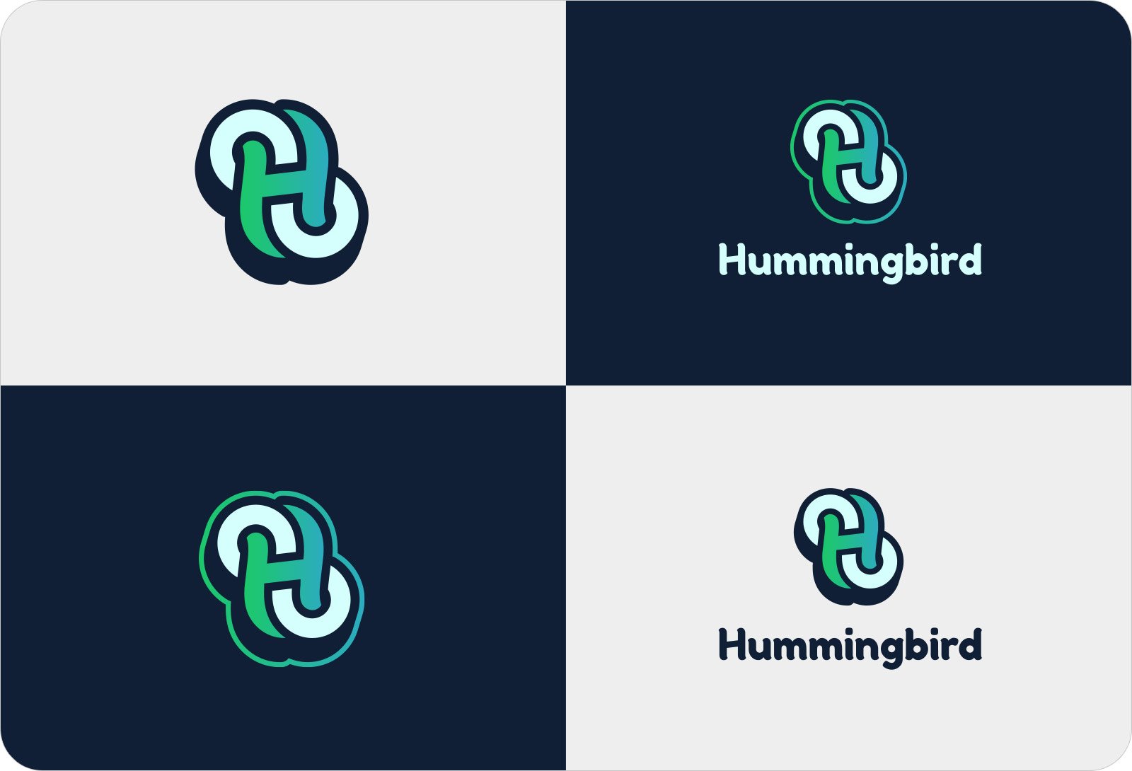
I designed a concept that takes the figure-of-eight flight path of a hummingbird’s wings, and combines it with the letter ‘H’ to form a unique, intertwined logo mark. This is a playful, yet sturdy logo mark and is designed to represent movement, efficiency and balance. I then customised the typeface ‘Fredoka One’ to match the softer style of the logo mark.
SERVICES
Logo Design
Stationery Design
Logo Animation


