Road Less Traveled Books
AWARDS
Logowave Wave 18 - 4th Place Winner
THE BRIEF
Road Less Traveled Books is a local book store in the heart of Farmington, Michigan. Recently retired owner Charles Allore needed a brand to launch his new store and reached out to me for some help.
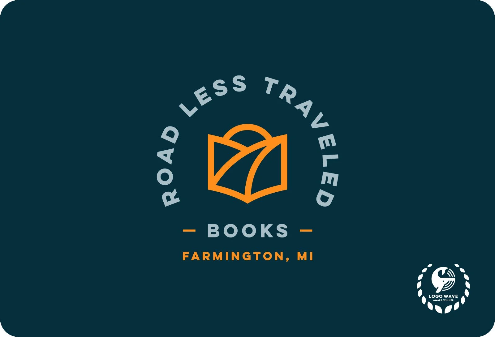
The store would be set ‘off the beaten path’, on a side street, so the location would sit literally on the the road less travelled. Charles was looking for a design both meaningful and enjoyable. His aim was to promote literacy and the arts and sciences in his local area. The name was designed to evoke the Robert Frost Poem "The Road Not Taken" and, as such, has overtones of his clientele being independent and not following the crowd. So the logo should ideally follow suit.
THE SOLUTION
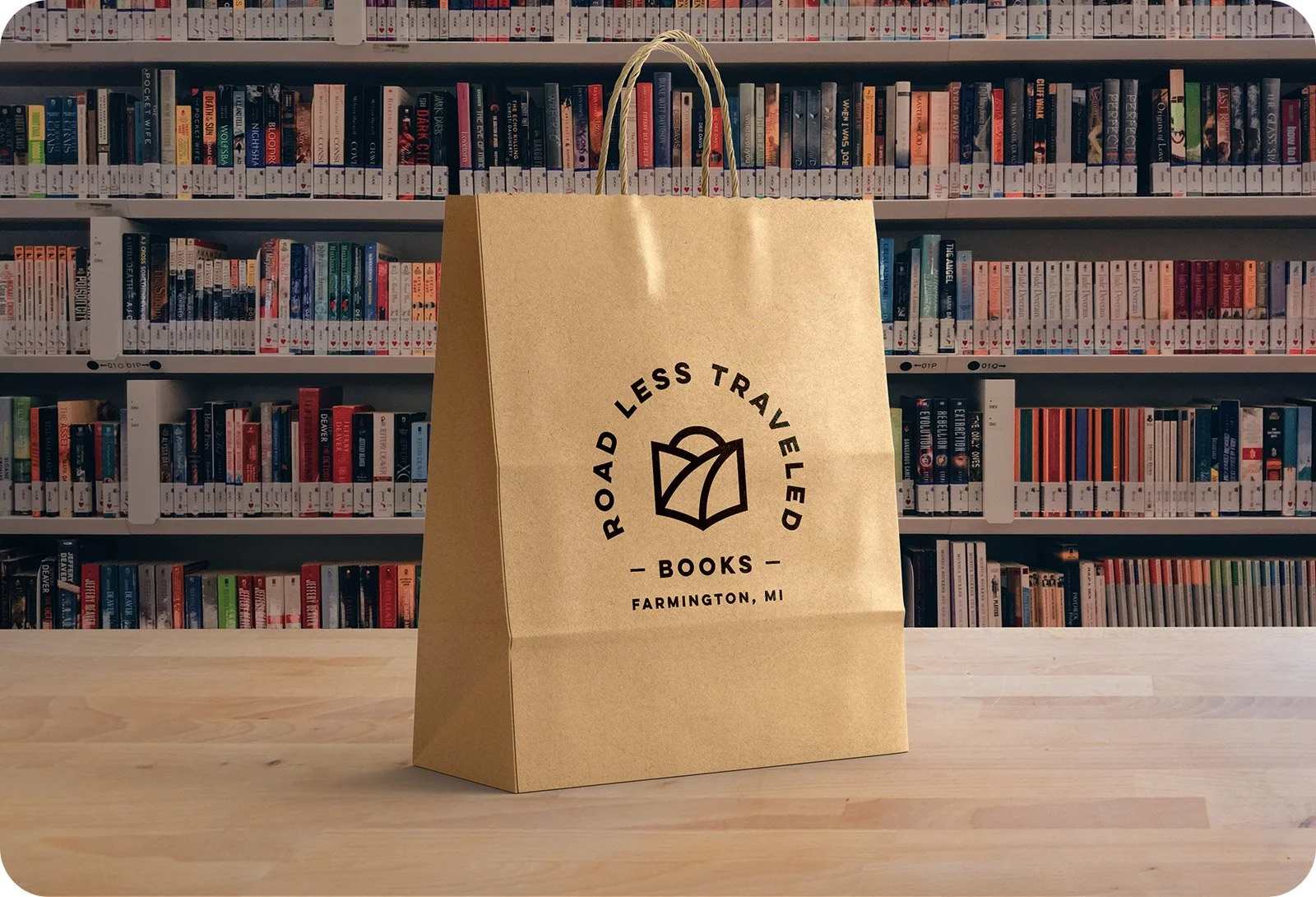
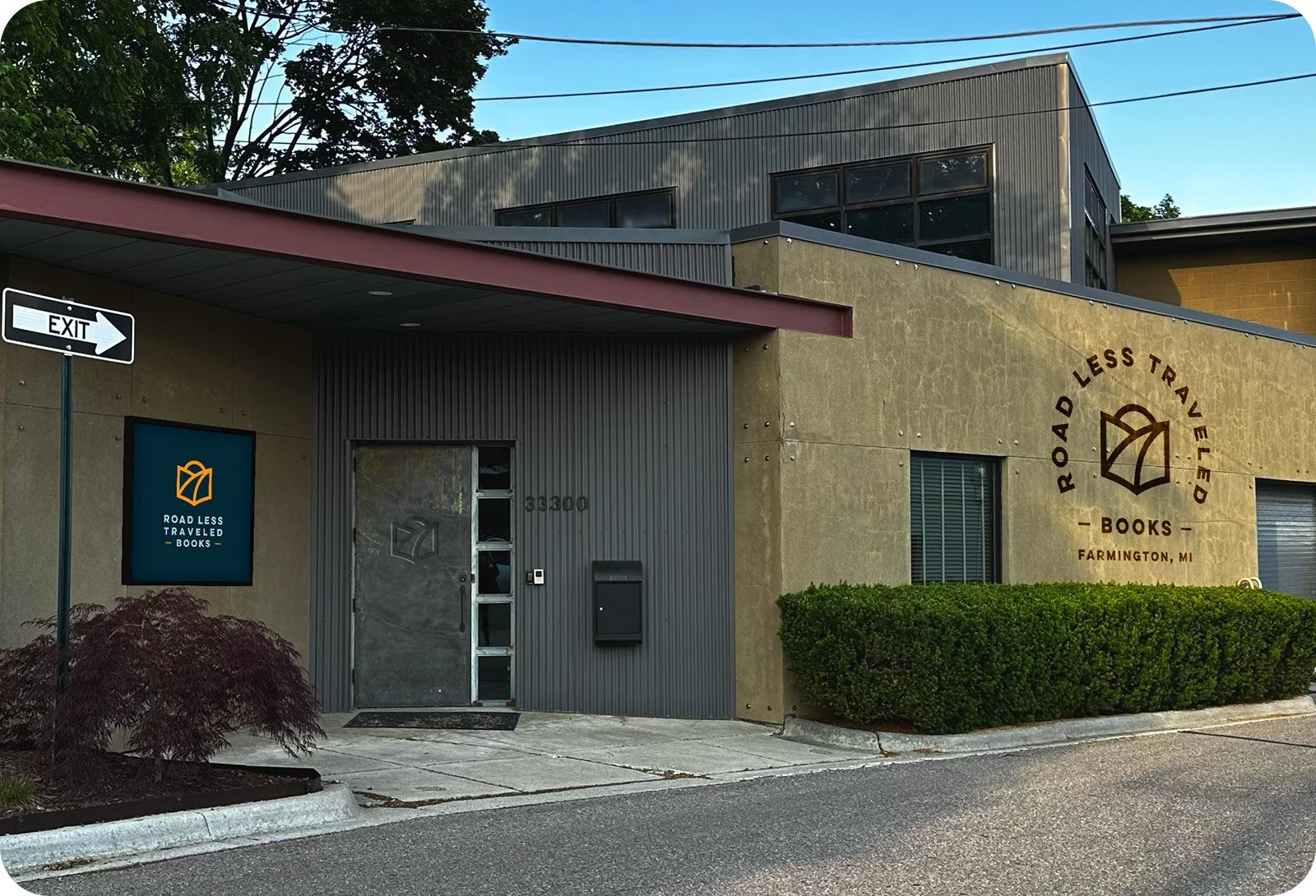
My design combines an abstract representation of a path within the shape of a book, with the path leading off into a sunset. This is also designed to represent a figure with their nose deep in a book. The result is a stylish, versatile and modern logo mark.
This option took a lot of finesse, with care being placed to keep the balance of the brand mark as uniform as possible.
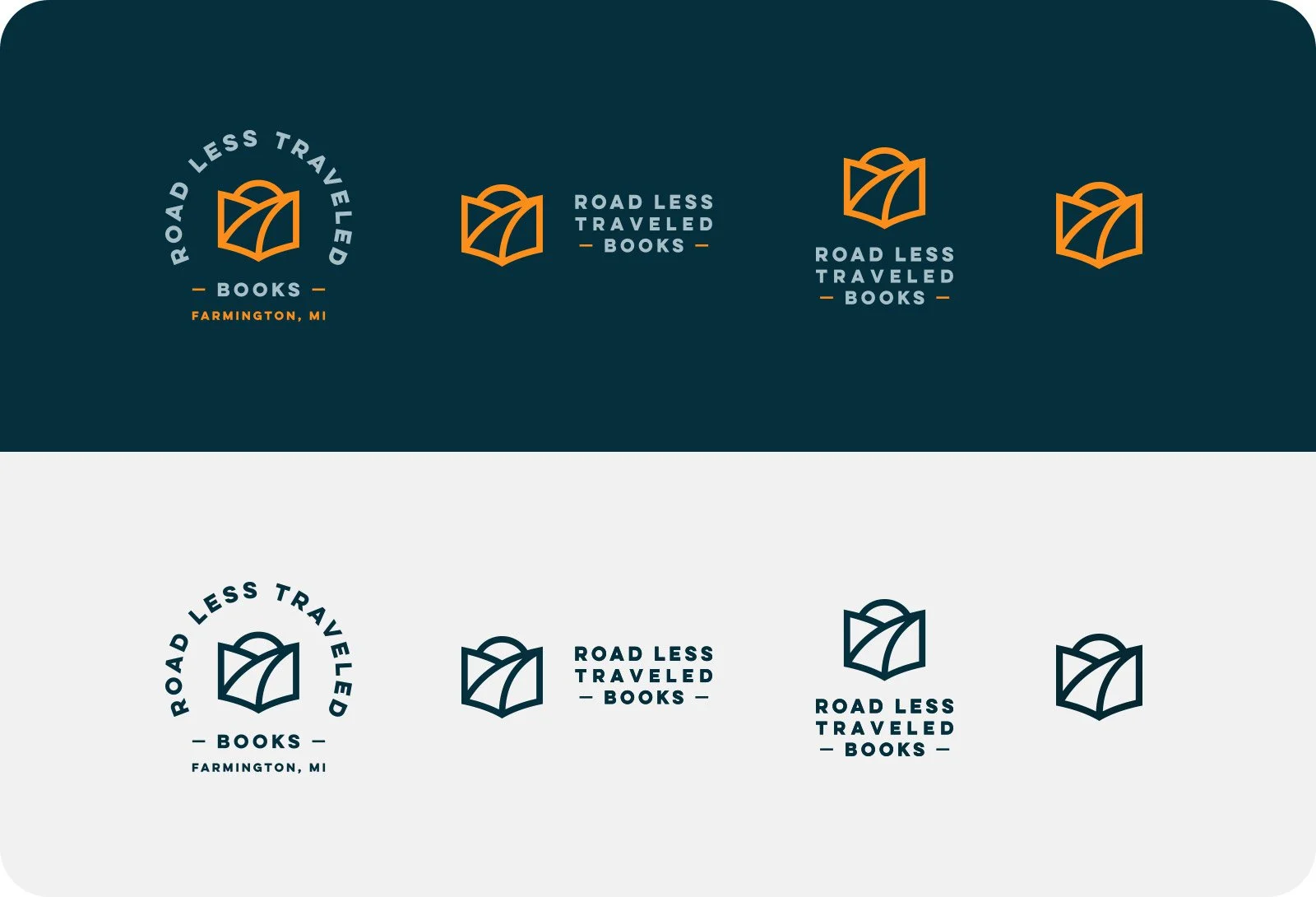
I provided Charles with multiple options to use in different formats, such as the front signage, all the way down to pin badges and bookmarks.
SERVICES
Logo Design

