
A Blueprint for a Logo.

Scenario.
You’re about to present a logo design to a client when all of a sudden an EMP blast (detonated by a corporate spy) wipes every electronic device in your building.
Your meeting is in 30 minutes. If you don’t win this client, your business goes under, your other half will leave you and your kids will disown you.
Can you recreate the logo, exactly, from scratch without the ability to measure, or trace over your old design?
* * *
I often have nightmares like this. What would happen if my hard drives and cloud drives were suddenly wiped? I hardly ever print anything off. My client presentations have been completely digital since the world went into lockdown. And my initial concept sketches are… rough, to say the least.
Would I be able to replicate my own work?
I worked in advertising before I specialized as a brand designer. Often, I would be tasked with incorporating a brand into a piece of display advertising. And while I was forever perusing the brand guidelines of big brands, I was always struck most by the page with the schematic diagram. The diagram that breaks a logo down into a grid or geometric system, and shows how it’s constructed.

Schematic diagrams of logos and their construction are very popular. They are an attempt to show the geometric harmony of a brand mark, and they serve as proof that accuracy and visual consistency have been maintained during the design process. They also look really cool.
These days it’s unlikely that a designer would ever need to reconstruct a logo from scratch. But with this diagram and some simple instructions, you should be able to. And not just a close approximation. The exact logo, to the minutest detail.
* * *
I’ll assume, for my own sanity, that fitting a logo to this grid/geometry system usually comes last, after the conceptual work is done. And obviously, this blueprint for a logo only works with certain types of designs (try fitting the Coca-Cola logo to a grid system).
So I set about researching some of the world’s most famous logos. I wanted to see which logos could be recreated using a simple set of instructions, often starting only from a shape.
Let’s start with a couple of easy ones.
Starting with an equilateral triangle only, we can recreate the Natwest and Mitsubishi brand marks with supreme accuracy. And I could continue this method for brands like HSBC and Google Drive.
Too easy. Let’s try something a little harder.
I was amazed at how easy it was to recreate the McDonald’s logo. I found this design system online, but by starting with a grid of squares only, we can recreate the logo perfectly. Looking at the golden arches, you’d think that the varying stroke widths towards the top of the M would be difficult to draw. But by drawing only four ellipses, we can replicate it easily.
Moving on.
Again, starting only with an equilateral triangle, we can replicate this Adidas brand mark with a supreme degree of accuracy. Or at least I thought I could. This one wasn’t as straightforward. The 13 triangles that I thought neatly governed the ratio and spacing of the three bars, didn’t quite work. It’s pretty close, but the heights of the three bars are also difficult to determine.

Getting harder.
From the outset, the Google G looks simple to reconstruct as it appears to start from a perfect circle. But it’s not. And it is has been intentionally designed this way because of something called Gestalt theory (read this article). Essentially, our eyes will often perceive a modified circle to look more circular than a geometric one. Type designers know this, so the tail of the G has been modified to be thinner than the weight on the other side.
As much as I tried to work out a system to recreate this logo perfectly, I couldn’t. It’s too nuanced. The one in the video is close, but you can see where it falls short when you compare them.

Let’s try something with a little more history.
Designed by Bruce Blackburn as the official symbol of the countrywide celebration of the United States’ 200th birthday in 1976, this logo is absolutely timeless. Bruce also co-designed the Nasa ‘worm’ logo, and you can see his style across the two.
I found a copy of this logo on Google. However, after I had reconstructed this version I discovered that the plans for the original logo already exist. You can see on the Chermayeff & Geismar & Haviv website that the corner radius starts just past the point of the star. Not so in the version I found. So either at some point the logo was changed, or it has been bastardised over the years. Proving that schematics like this are all the more important for posterity.

When used correctly, a blueprint for a logo design can add massive value to a branding project. This is especially helpful for designers who might feel forced into justifying their costs.
It takes effort to appear effortless.
This is a mantra I use after I’ve just sent a cost proposal to a client. Designing a ‘simple’ and ‘clever’ logo is difficult. It takes a lot of experience, and sometimes weeks or even months to get right. Simplicity stands the test of time. But when you’ve accomplished an effective logo that conveys your message in a simple way, it can be easy to look at the design and say, “Well I could have done that!”.
By showing the workings behind your design in a schematic diagram, it often helps a client rationalise the money they may have just spent. It is proof that care and attention has gone into the face of their company, and it can add polish and professionalism to a presentation.
However, this isn’t a one size fits all approach. While grids and geometric design systems can govern a design, they can also hamstringing it and stifle creativity. If your logo achieves visual balance without fitting to a grid, then you shouldn’t attempt to retrofit one, or apply imaginary lines that work after the fact.

The grid can be used to tidy up a design in the last 10% of the design process. But it shouldn’t govern you completely. There’s such a thing as going too far…
Bonus: Failed experiments
Some logos I attempted to recreate simply would not conform to a simple geometric construction method. Two examples were Nike and Apple.
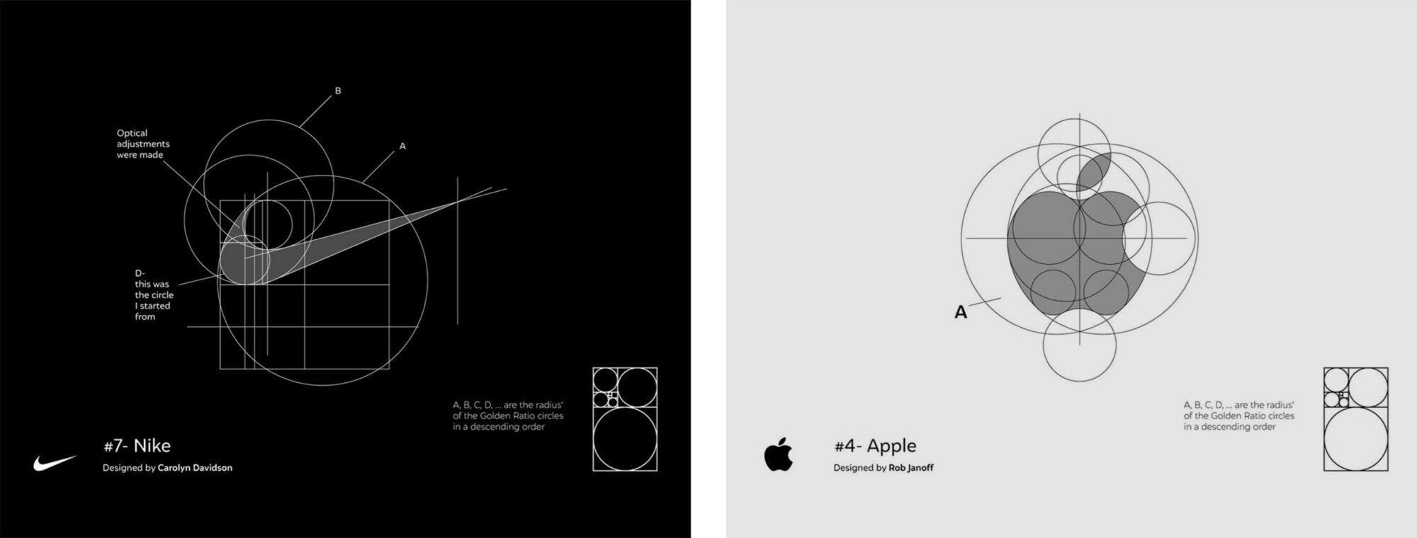
Source: The Logo Creative
I really wanted these to work. The diagrams above show the Apple and Nike logos lining up perfectly with circles formed using the Golden Ratio. But they don’t work. As good as they look, they’re not accurate and require some ‘optical adjustments’ to fit. Which defeats the purpose. I couldn’t find reference points to position shapes against to get an accurate reconstruction. They are simply too bespoke.

From the 1987 Apple Identity Guidelines. Source: Arun.is
While some designs couldn’t be tamed, others could, but were extremely complicated to recreate.
I am, and always will be, the biggest fan of the N64 logo. The colours are so distinct and recognisable, plus they coincide with the colours of the buttons on the Nintendo 64 controller. It might not work as practically these days (it’s hard to make a single colour variant) but it’s a joy to look at and the emblem fills me with nostalgia. I didn’t include this as a main example as the starting point (the diamond and their relative spaces) required measurements to replicate.
Again, the steps required to recreate the TikTok logo were too difficult. It had to be started with a specific measurement and some complicated ratios to create the corresponding circles. Not ideal for an easy construction, but still a fun process if you can follow along.
And finally, the Nakatomi Plaza logo from the building that Bruce Willis saves from terrorists in the movie Die Hard. It is another one of my favourites. But although it’s fun to recreate, it’s not accurate. The real version is actually less uniform than the one I’ve made above!
Resources/Further Reading:
U.S. Bicentennial, Chermayeff & Geismar & Haviv
20 Famous Brand Logos Constructed in Grid Systems, The Logo Creative
Should you use Logo Design Grids, Guides & Pretty Circles in your Logo Designs?, The Logo Smith
The do’s and don’ts of using logo grids, 99designs
Rediscovering the Apple Corporate Identity Guidelines Notebook Rediscovered by Arun Venkatesan, The Logo Smith