Gym Challenge Meals
THE BRIEF
Gym Challenge Meals is run by Alex Marlow out of South Australia. Alex’s meal-prep business GCM was spawned after an F45 gym opened up in his rural home town of Mt Gambier, and he began offering prepared meals from the F45 meal plan to the gym goers in his area. The idea was such a hit with the locals (hitting 500 meals a week within 3 months) that he eventually closed his cafe and started his meal prep kitchen full time.
The business grew into a kitchen/cafe, where you can grab fresh meals off the shelf, smoothies, Acai bowls, snacks and coffee. It’s so successful, that Alex wants to start a franchise. But when he went to trademark his old logo, which was modelled off the colours of F45, it was rejected.
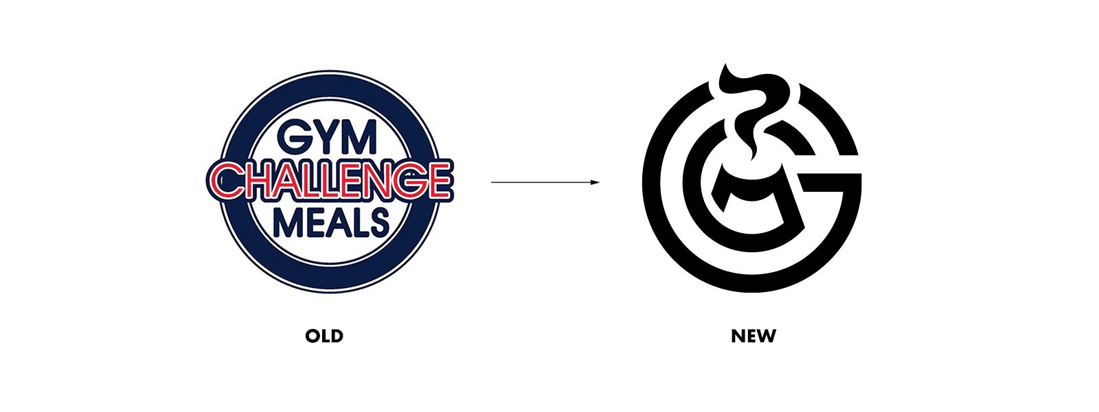
Alex came to me for a unique revamp, that would pass the trademark test. The new logo would need a revised colour palette, and to move away from pigeon-holing his business in the gym space, which proved to be a little intimidating to new customers. His food is for the public, not just gym-goers. It also should show off the fresh nature of the food, and allow for different location names to be included as the business grows to more than one location.
THE SOLUTION
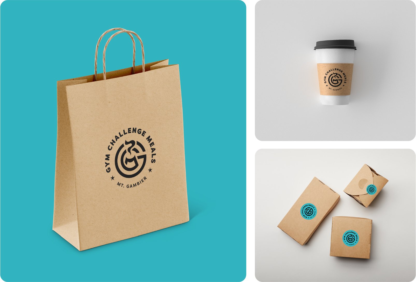
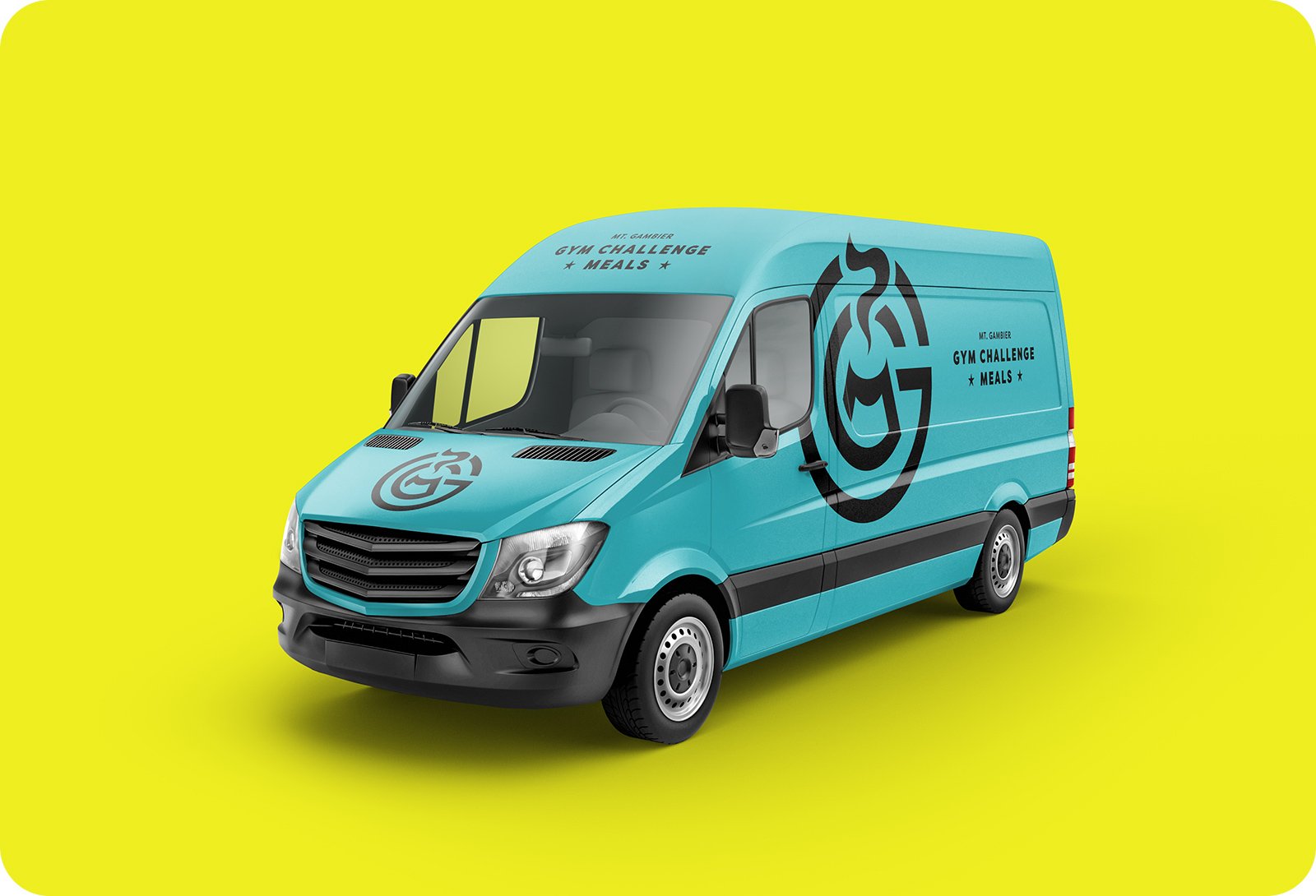
Over the course of a couple of months, Alex and I worked to refine this monogram brand mark, styled with the acronym G.C.M. Inside the design, the M is shaped like a bowl (the takeaway/meal-prep nature of the dishes lends itself to being served in a bowl) with steam emanating from the top representing the fresh nature of the food. This brand mark is then accompanied with the type arranged in different formats for different design mediums.
The design is also a nod to the dormant volcano of the Blue Lake crater of Mt. Gambier, where the business originated.
This option took a huge effort to refine, with no less than 100 iterations by myself to come to this balanced, elegant logo mark. The circular style is reminiscent of the old circular logo, but the new colour palette makes the design completely unique and separates it from the original F45 connection.
TESTIMONIAL
"When I first saw James and his work appear on my TikTok feed, I knew I needed to engage his services to create the new logo for my business. James didn’t disappoint, expectations have been exceeded. Such a pleasure to collaborate with, Thankyou!”
SERVICES
Logo Design


