AMIGO TECHNOLOGY
THE BRIEF
Technology and services business Amigo decided to rebrand. After toying with a new name (some versions of which we explored) the company ultimately decided to stick with Amigo, but wanted to revamp their logo.
The name hails from a previous era when the software they provided was for refer-a-friend programs. Now they engage more with large enterprises and new logo was needed to represent their three service areas more accurately.
THE SOLUTION
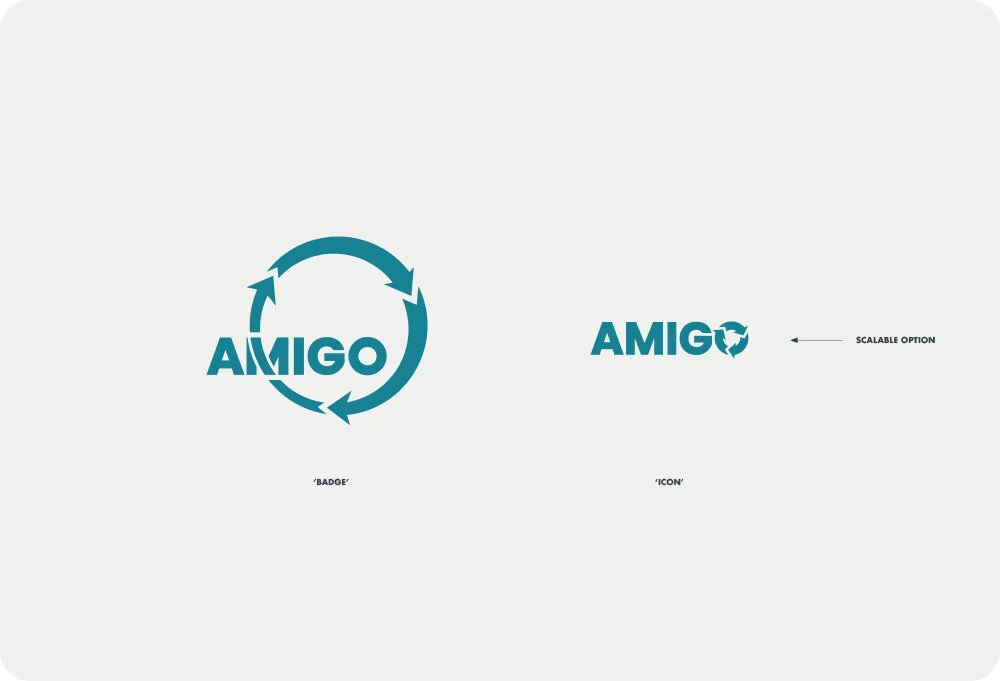
After a great discovery session, it became clear that the nature of the new company name revolved around a three-step cycle (decide, build and run).
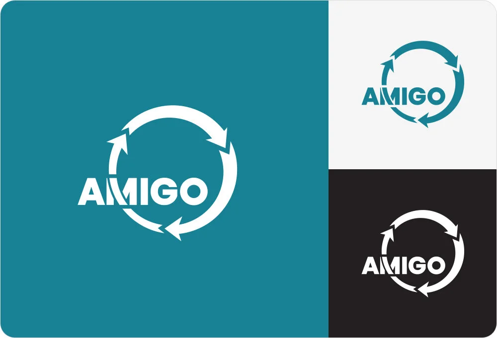
This cyclic lockup treatment works really well as a logo mark as the text is balanced nicely in the centre. I then generated a scalable version of the logo. This ‘icon’ variation would only be used in very small applications, and as a supplementary icon to the main logo.
TESTIMONIAL
“Having worked with a wide range of designers, James stands out as providing the highest quality service.”
SERVICES
Logo Design

