


The WINE TREASURY
THE BRIEF
The Wine Treasury is an award winning, London-based wine importer representing forty or so wine producers from around the world. Their MD James reached out to me to celebrate the company’s 20th anniversary with a refresh to their logo.
While their target audience varies wildly, a typical customer might include a restauranteur or a sommelier from somewhere like the Savoy. Essentially, the logo needed to look premium and dependable, show high standards, but also feel adventurous and imaginative.
THE SOLUTION
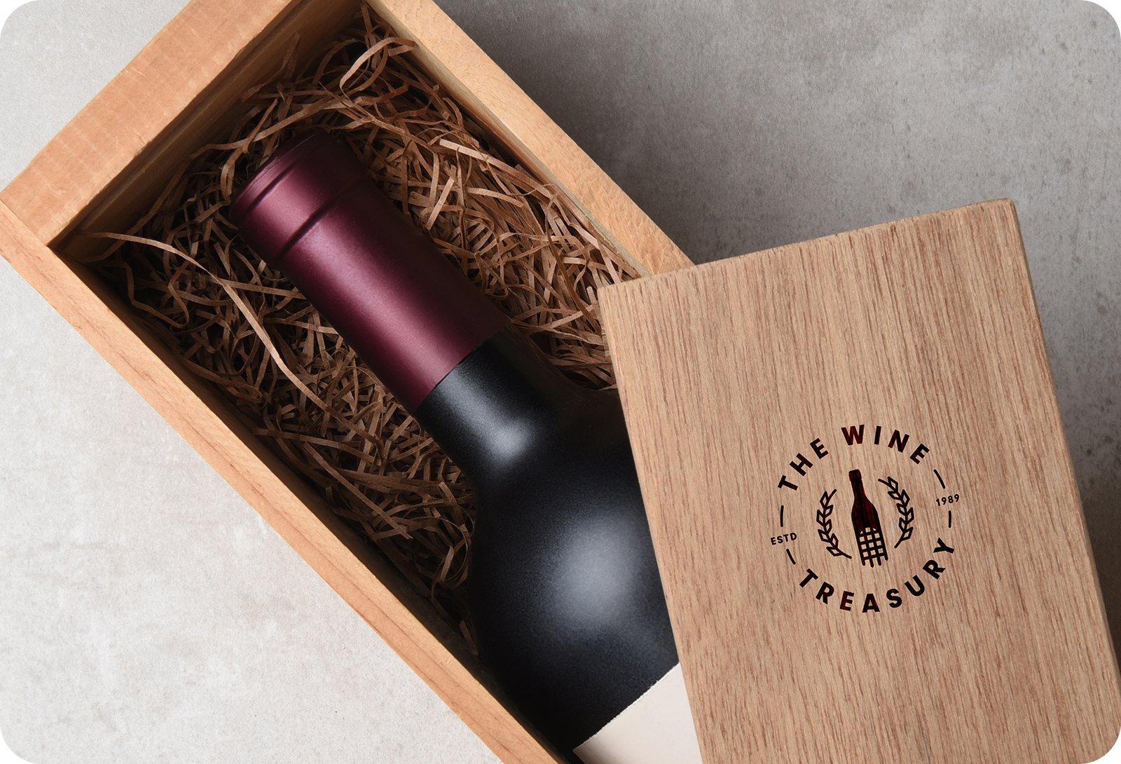
I presented two options, one of which we refined down to what you see here. This logo takes a number of key themes agreed in our discovery session, and melds them all into beautiful, formal badge setting. The central icon uses a portcullis incorporated into a wine bottle shape. This emblem is then wrapped inside a grape vine wreath to give the lockup an almost regal or government bureau style.
The beauty of this design is that elements can be lifted and removed to create multiple, scalable options to be used in different design formats. For example, the largest badge format can be used on printed material where it is most legible, and the icon format can be used in small formats, like a website favicon or on a pin.
The typeface ‘Neuzeit Grotesk’ is bold, easily read and modern. Perfect for any logotype. It’s simple, timeless and represents the ethos of the brand in the clearest way possible.
TESTIMONIAL
”We are absolutely thrilled with the logo James has designed for us. He was able to grasp our admittedly slightly vague brief, come up with an idea and refine it until it was perfect: a very happy customer.”
SERVICES
Logo Design