


Suomen Kultareservi
THE BRIEF
Suomen Kultareservi, or ‘The Finnish Gold Reserve’ is a gold sales service based out of Helsinki, Finland. They are rated as one of, if not the most prestigious gold buyers in Finland, but their logo wasn’t doing them justice. CEO Sebastian Rasimus asked me to help them move away from their current ‘SK’ monogram logo, into something much more reflective of their high quality and trustworthy service.
Sebastian was looking for a design that embodied Finland, while at the same time represented what the company actually does; buying, recycling, storing and selling gold. All the while showing the premium and sophisticated service that Suomen Kultareservi provides.
THE SOLUTION
During the design process, Sebastian and I worked through no less than four completely original concepts, before finally landing on a design that we were both proud of.
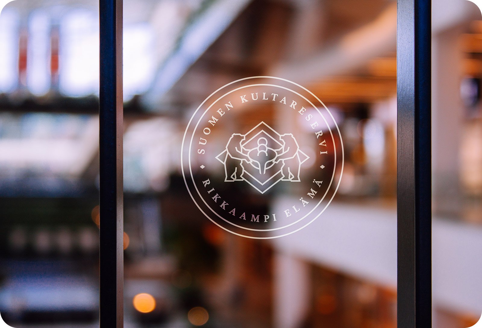
The rebrand is a line drawing of two brown bears (the national animal of Finland) tipping a smelting pot. Submerged in this pot are three coins, which are then melted, recycled and poured into a new diamond-shaped outside container, which represents a gold bar mould.
This design uses a fine line weight to add a level of style and balance to the crest, which works superbly well against the new colour scheme.
TESTIMONIAL
“Everything turned out better than I could've ever imagined. James is truly one of the best graphic designers I've ever met and his understanding of branding is just next level.”
SERVICES
Logo Design