


Kyler Engineering
AWARDS
'Runner Up',
Best Brand Awards 2023
THE BRIEF
Matthew Kyler, a licensed civil engineer and founder of Kyler Engineering reached out to me after seeing my work for Taylored Technology and asked for some help rebranding his structural engineering firm. Matthew’s firm tailors unique solutions to each of his clients, and his company is known for tackling projects that most other firms might not. He was looking for a new approach to his logo, and for something that would work neatly on stationery, and on technical drawings for his clients.
THE SOLUTION
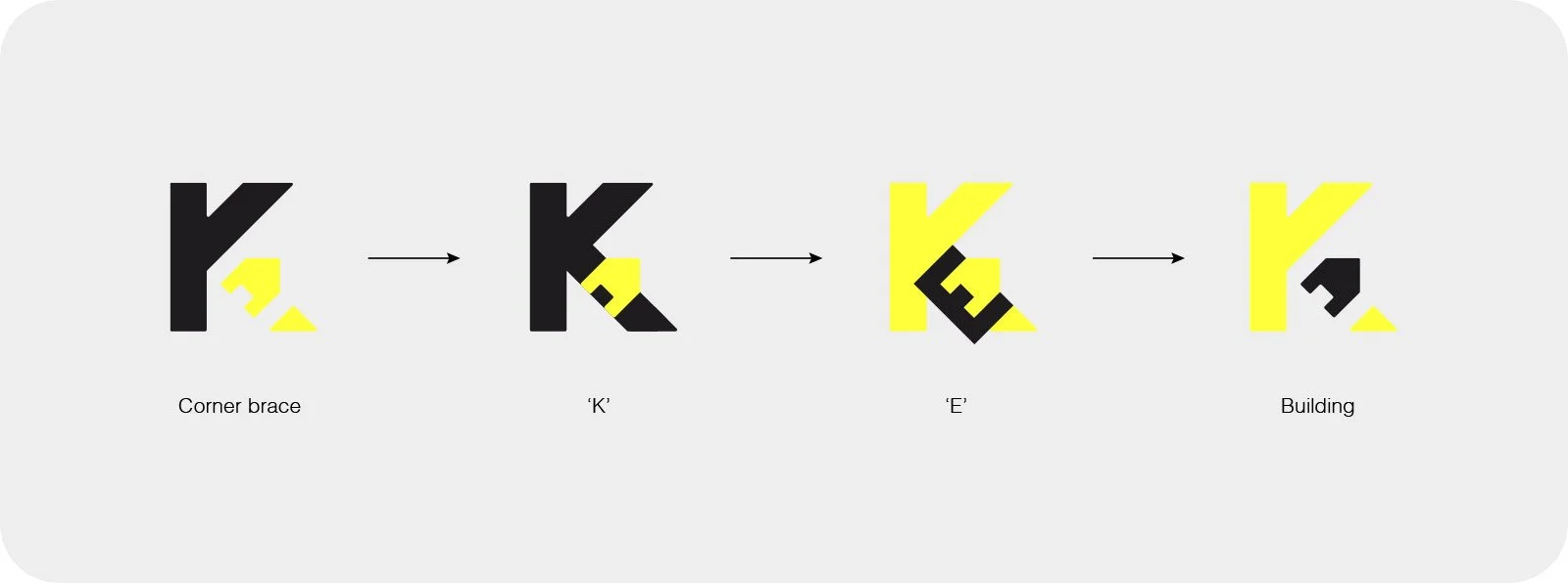
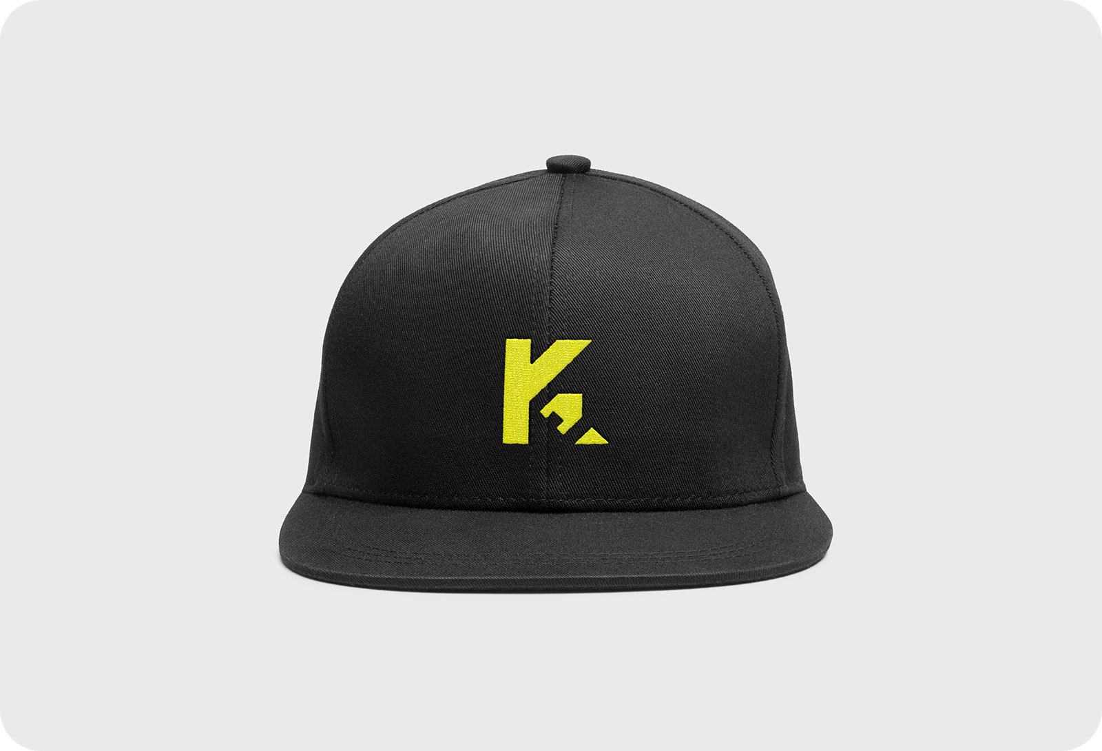
The new logo takes on a number of meanings. I worked up a monogram of the initials K and E, where the E is hidden in the negative space. But the stem and the arm of the letter K represent a corner brace, showing strength and stability. Woven into the leg of the letter K is a symbol for a solid building; both meanings tieing nicely into the theme of structural engineering. This concept is simple, well-balanced; the triangular sections slotting neatly into each portion, which represents Kyler Engineering’s incredible attention to detail.
TESTIMONIAL
”After several failed attempts with other designers, I was worried about not being able to communicate what I wanted in our new logo. James made it so easy. We had a couple of web meetings so he could get to know our brand and me. He came back with a logo that encompassed everything I wanted to include. Thank you!”
SERVICES
Logo Design
Stationery Design