


Archon Studio
THE BRIEF
Archon Studio is a big player in the board game, wargaming, and RPG terrain market. These guys create models in the highest-quality plastic at their factory in Poland. They also sell their own best-selling board games, which had me particularly excited as they have multiple He-Man board games under in portfolio (I was a big fan as a kid).
Archon’s CEO Jarek Ewertowski messaged me and asked if I could help rebrand the company. They were looking to move away from a monogrammed ‘AR’ logo into something a bit more unique and with meaning to their company. I would need to stick loosely to their red/black colour scheme, but the rest of the design choices would be up to me!
Side note: Archon have a big team of internal designers who’d all had a crack at making a new logo for the company. So the pressure was well and truly on to make something unique and memorable for them.
THE SOLUTION
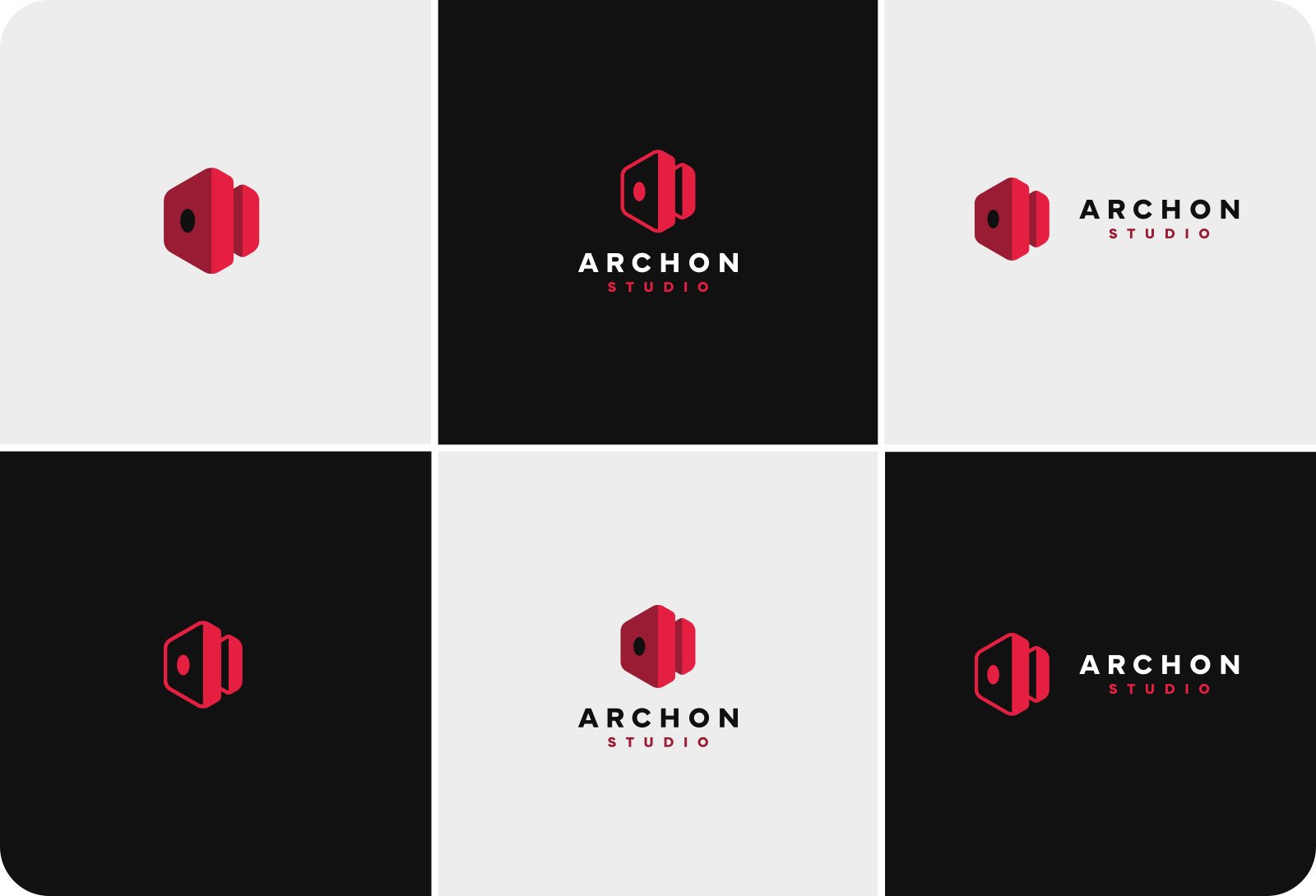
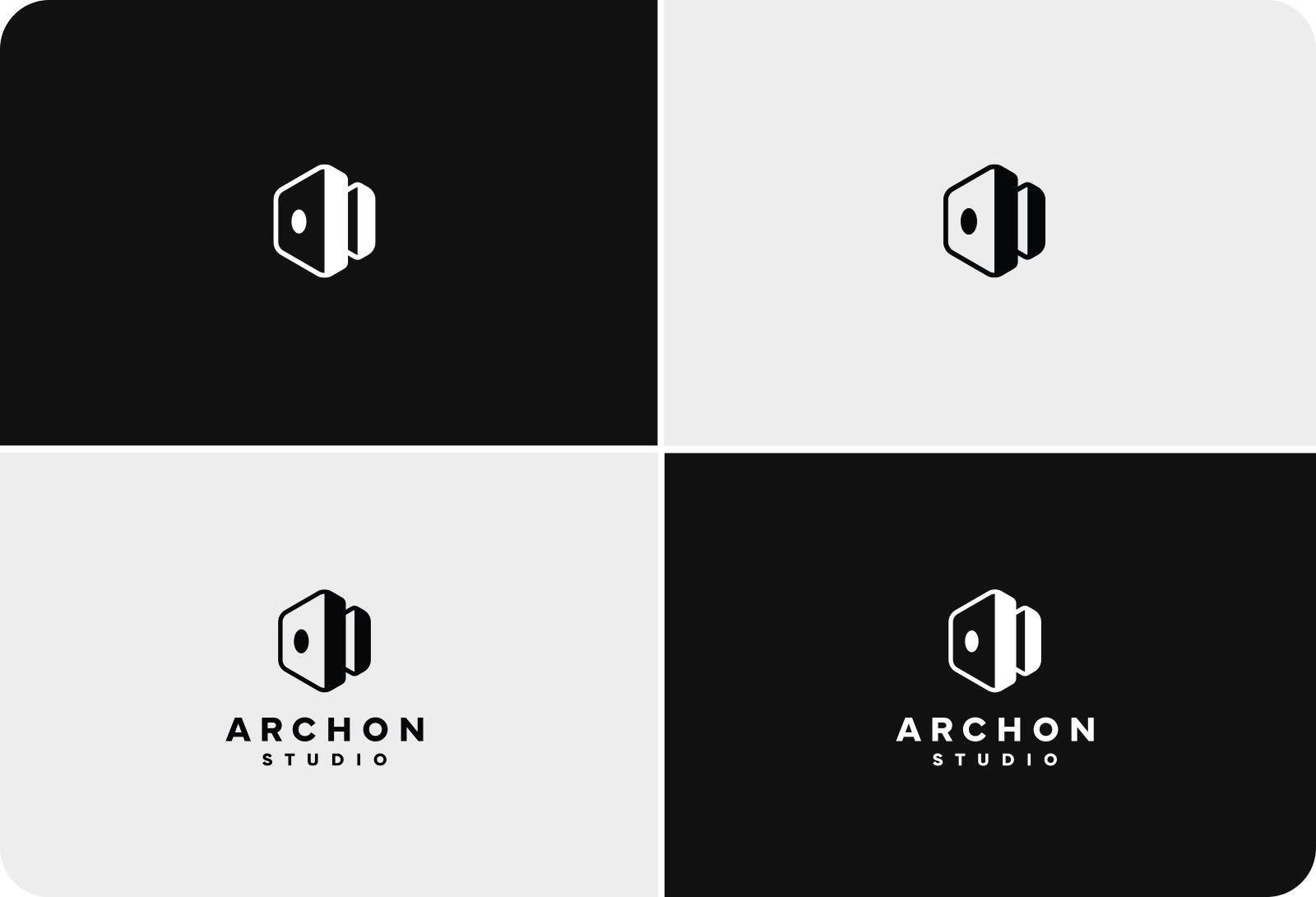
In doing my research about the company, I learned a lot about the injection moulding process that Archon Studio uses. There’s a lot to it, and it was so interesting, particularly one of the final stages when the plastic is forced in between two aluminium moulds via a central nozzle.
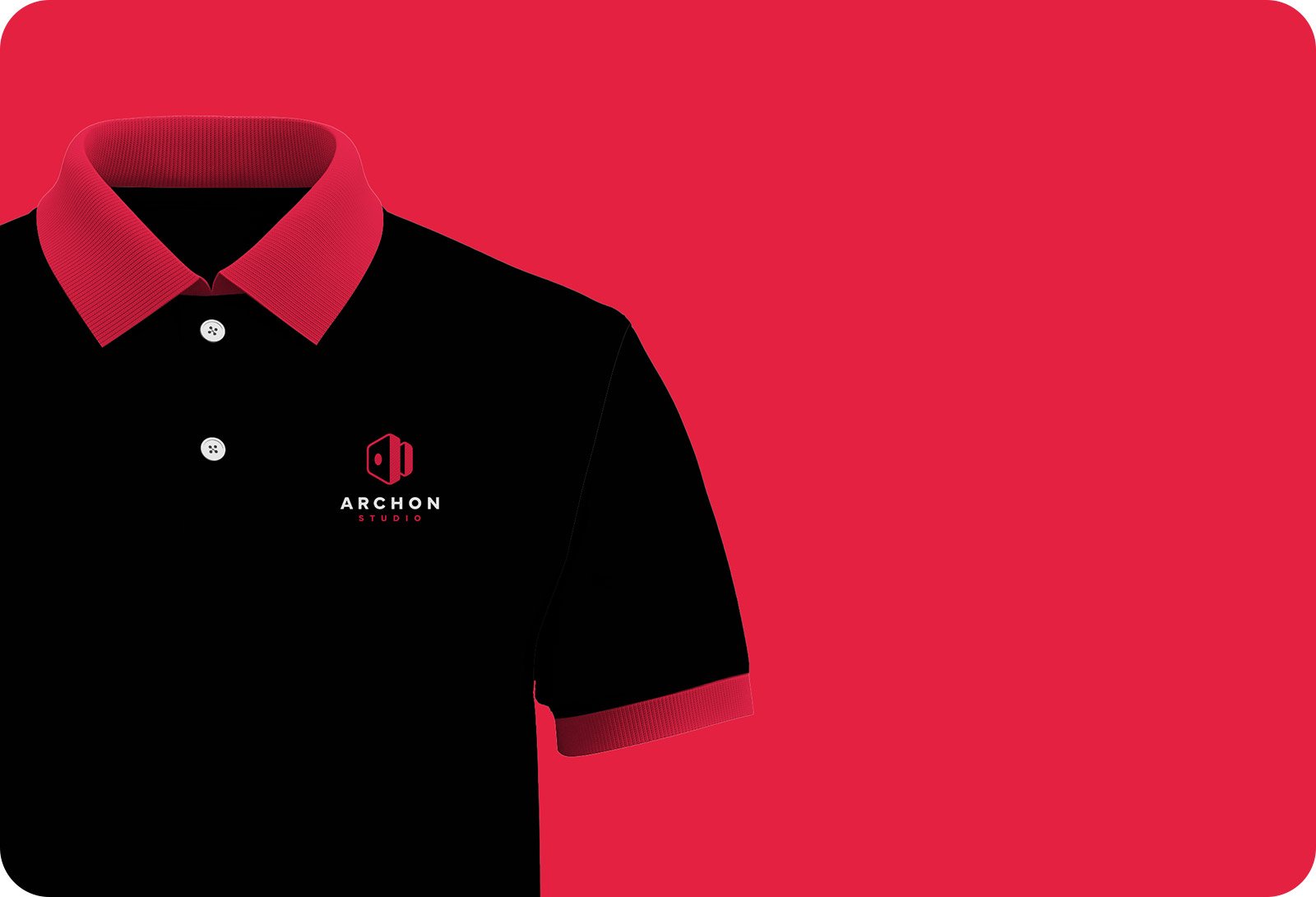
The design I came up with combines the traditional hexagonal tile shape from a board game, with an isometric representation of two aluminium moulds that are used in the injection moulding process. The central hole on one side of the design not only represents the entry point of the nozzle, but also resembles a D6 (a six-sided die).
SERVICES
Logo Design
TESTIMONIAL
"We believe that this remarkable change will not only resonate with our existing clients but also attract new partners and customers who share our passion for creating outstanding products." - Jarek Ewertowski, CEO